Pocket Advisor Case Study
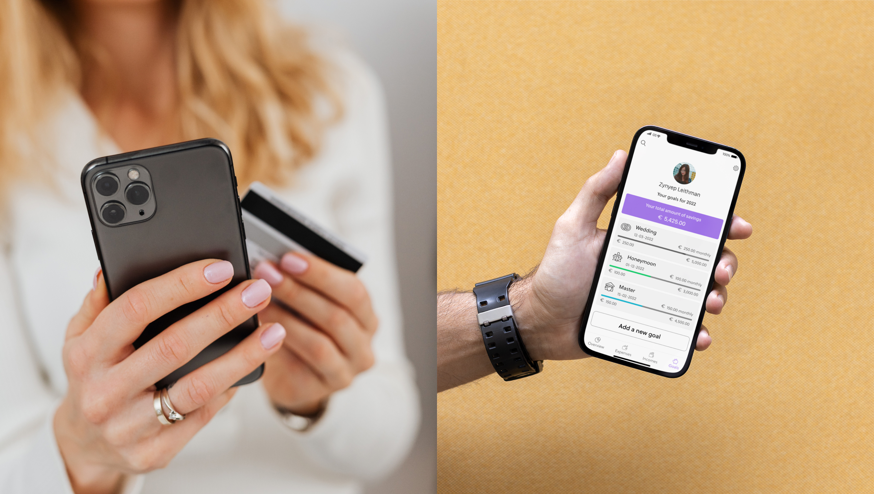
About Pocket Advisor
Pocket Advisor is a money-saving app that helps people save money for a future expenditure or purchase. It guides users how to keep on track easily with their expenses, incomes and savings.
The Challenge
Create a responsive web app for people who do not like to deal with their finances. Give users clear information about what they can do to better save.
My Role
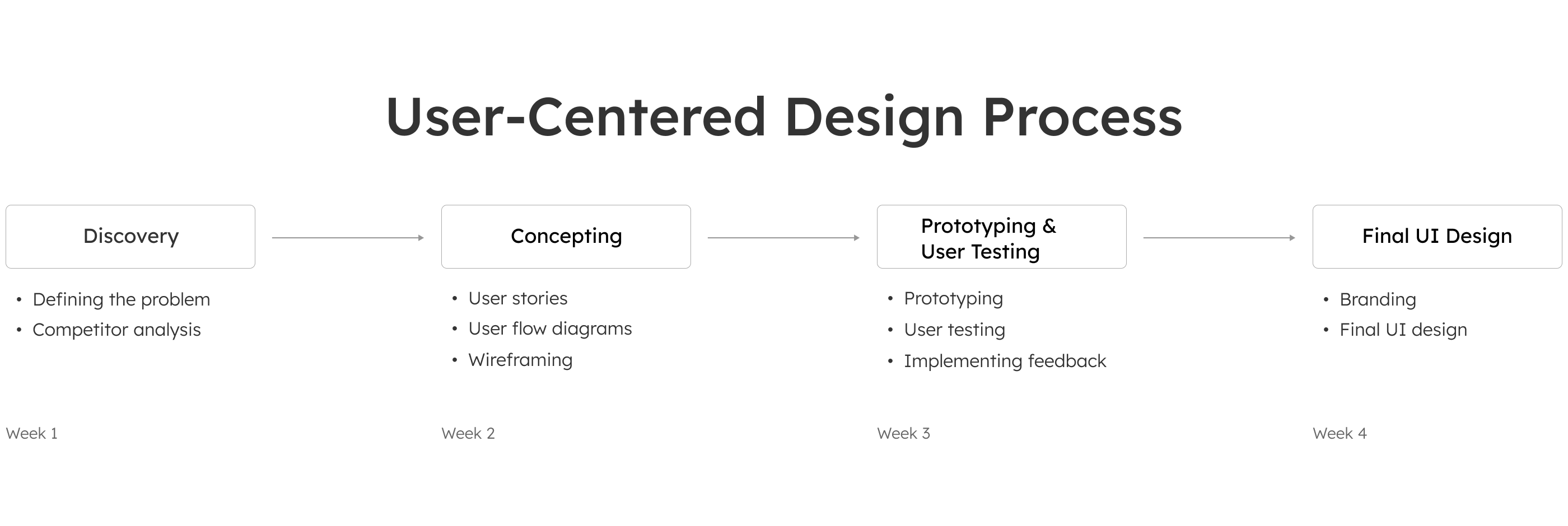
- Understanding and defining the problem
- Conduct a competitor Analysis
- Create user stories and based on them user flow diagrams
- Wireframing and Prototyping
- User testing and Implementing the feedback
- Create a product Brand
- Visual and User Interface design
Solutions
- Personalized account with detailed information on user expenditure and incomes
- A functionality of setting saving goals
- A complete overview of the expenditures, incomes and savings

Discovery
Defining the Problem
People who don't like to deal with their finances find it difficult to create saving goals. Knowing how much they spend and on what can help them make saving plans. Having an overview of all the expenditures, incomes and savings in a one place can make the mission of saving easier.
The Design Process
Competitor Analysis
To understand what other similar products are out there, I conducted an UX competitor analysis for responsive web apps intuit Mint, Finanzguru, Money Stats and Monefy.

Main insights
Layout
- The difference between pressed and unpressed button should be clear for the user.
- Highlighting the key words in the text makes it easier to understand where to find the most important information on the page.
Usability
- The transition from one page to another should happen fast. The user should see the progress of the loading page.
- Having a good security for a financial web app gives user trust to use it.
Navigation
- The navigation on the Home screen should be simple and accessible.
- Consistency in navigation on both the mobile versions as well as on desktop version is essential.
- Too many charts without explanations can overwhelm the user.
Compatibility
- Optimizing the webpage with the keywords makes it easier to find in Google search.
- An app accesible on both Android and iOS gives it credibility and trust.
- Having a webpage for the mobile apps is essential for the online presence.
Call to action
- Calls to action should differentiate from the other text.
- Clear and concise calls to action determine the user to follow them.
Differentiate
- Calls to action that will motivate the user to take the challenges.
- Shorter text with clear and concise information.
- Assurances about the security system of the web app.
Concepting

User Stories
- As a new user, I need to be able to create a profile, so that the financial advice I receive is personalized to me, my spending habits and tailored to my goals.
- As a user, I want to see a dashboard of my finances clearly and visually, so that I can see how much I am spending and what at a glance.
- As a user, I need to be able to tell the tool what my saving goal is and how long I have to reach it, so that I can save accordingly.
User Flow Diagram
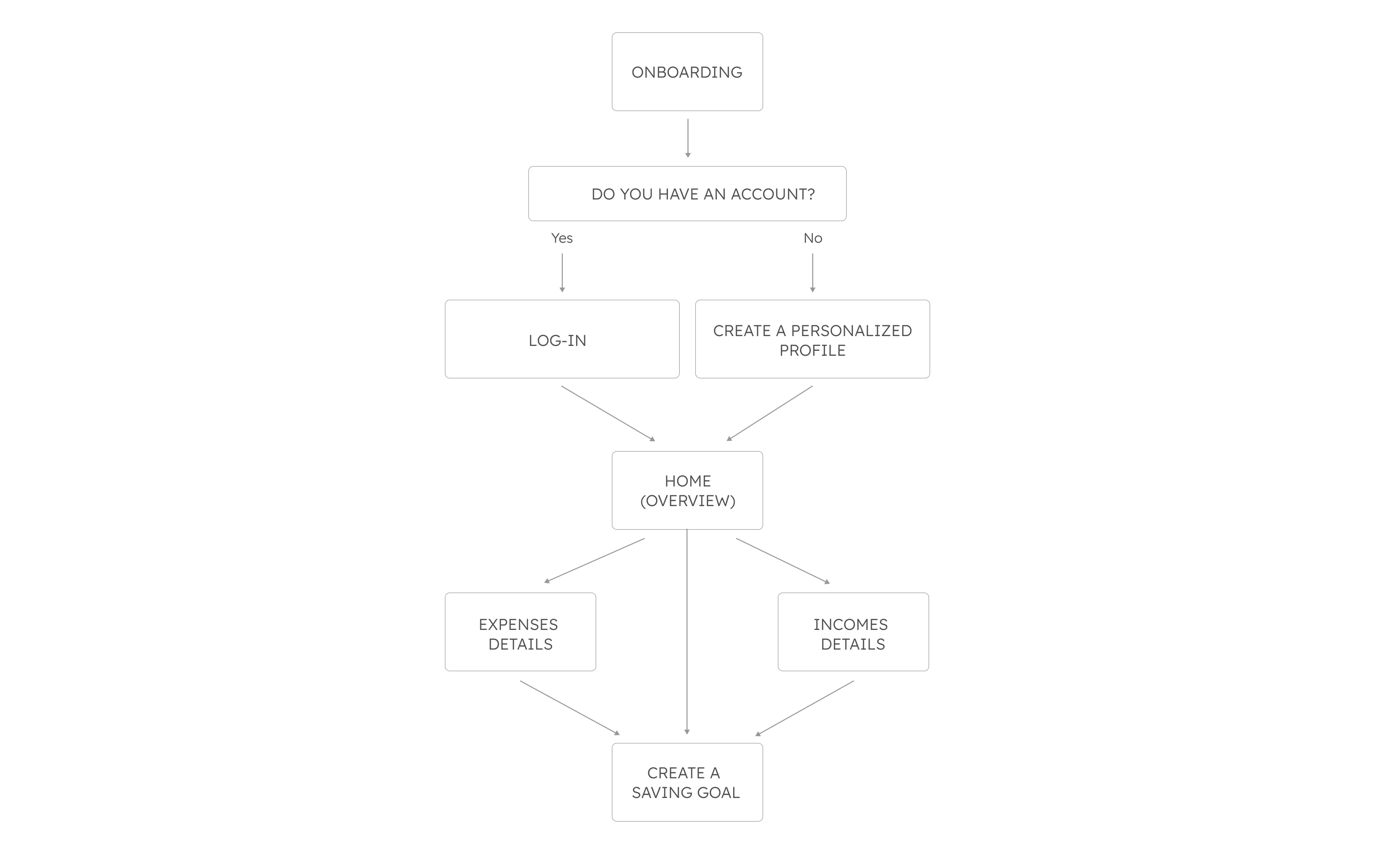
Based on the competitor analysis and user stories, firstly I created the user flow diagrams for each of the functionalities. Then I created a single user flow diagram with all the web app features.
- Create a personalized profile
- See the dashboard of the finances
- Create a saving goal
Wireframing
After creating the user flow diagram, I started sketching the low-fidelity wireframes with the main functionalities.
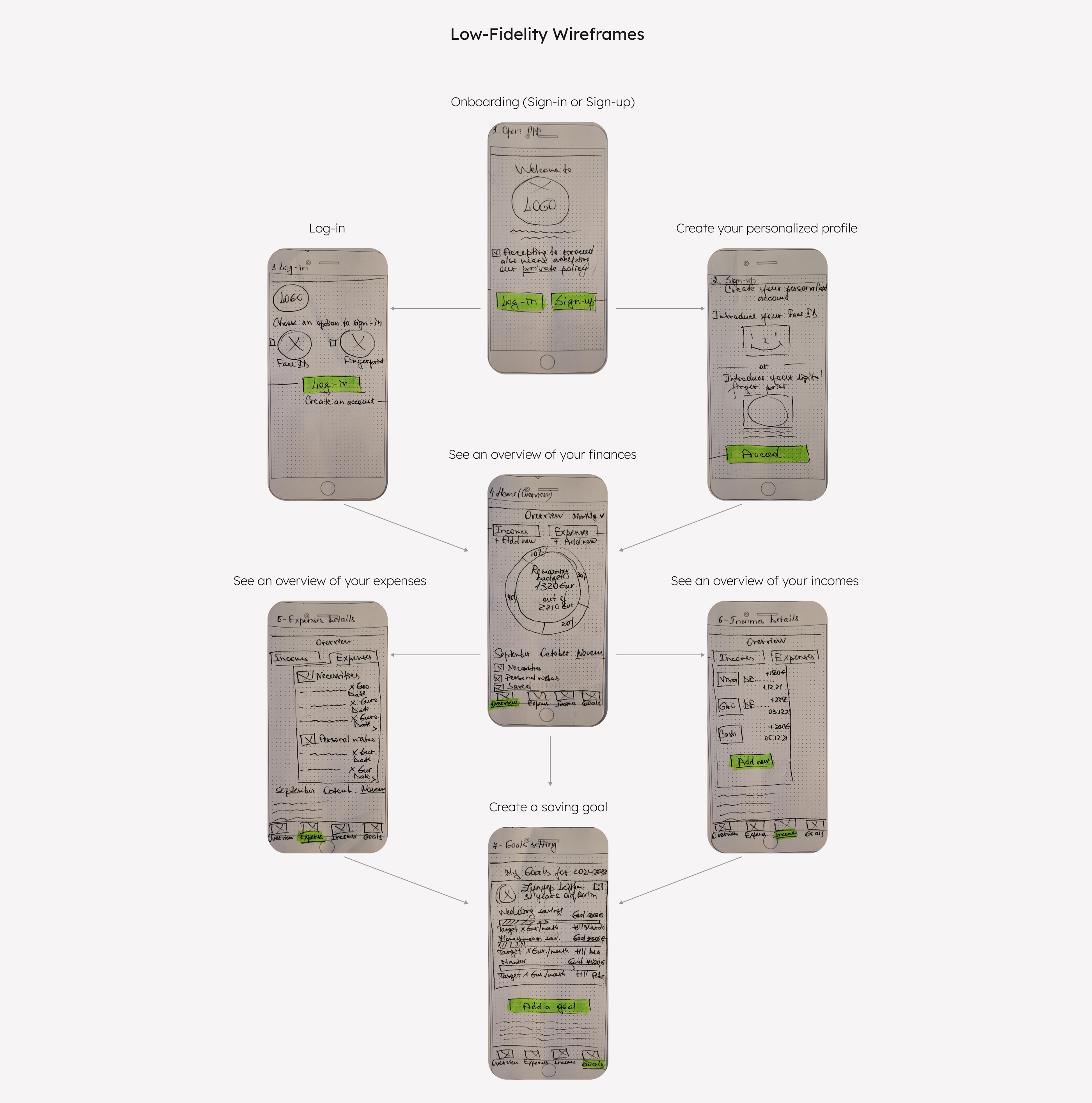
Prototyping and User Testing
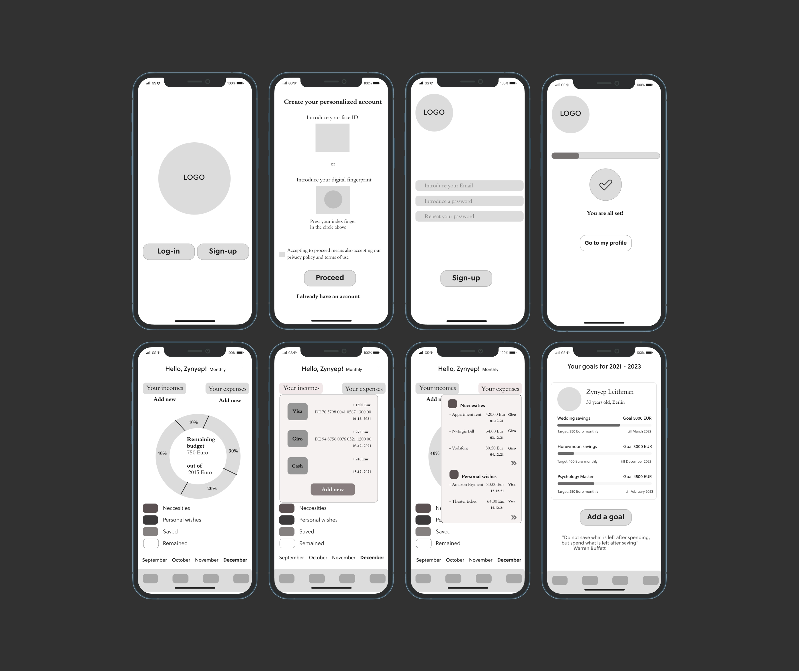
Creating a Prototype and Testing it with the Users
After designing the mid-fidelity wireframes, I created a prototype in inVision. I conducted a scenario-based user testing with more than ten users. I tested the main functionalities of the app.
User Testing Analysis
I categorized the problems in critical and preferential.
Critical problems
1. Confusing diagrams of expenses and incomes.
Recommendation
Change the correct numbers in the diagram, make a percentage difference through color highlights.
2. No exit option from the "Expenses" and "Incomes" screens.
Recommendation
Create a "X" button in the top right of the Expenses and Incomes screens/make them separate screens.
3. No Overview for the total amount of money the user saved or spent in a month.
Recommendation
Consider writing an Overview for saved and spent money on the Home screen.
Preferential problems
1. The user doesn't know exactly what the money are saved for.
Recommendation
Introduce an icon or an UI element that would show the user what his/her priority goals are.
Branding
Pocket Advisor's Mission
Help people save rapid and painless for their future dreams.
Guiding principles
1. Reliability
Pocket Advisor is a reliable tool. It protects the user's data and keeps its promises.
2. Mutual trust
The users trust Pocket Advisor and Pocket Advisor trusts the users.
3. Simplicity
Pockets Advisor is a simple tool accessible for anyone.
4. Cooperation
Pocket Advisor doesn't function alone. The feedback of it's users is essential.
Logo
The logo expresses the values of the product. The hand with the plant symbolizes the control we can get over our finances if we learn how to handle them.


Typeface Choice
Soleil typeface communicates freshness, dynamism and contemporary. It's a typeface based on the modernist ideas of simplicity, clarity and reduction to the essential forms. It gives the product a friendly and approachable feeling.
Soleil is combined with San Francisco typeface. San Francisco expresses seriosity and high quality. Together they communicate trust and stability.
Color Palette Choice
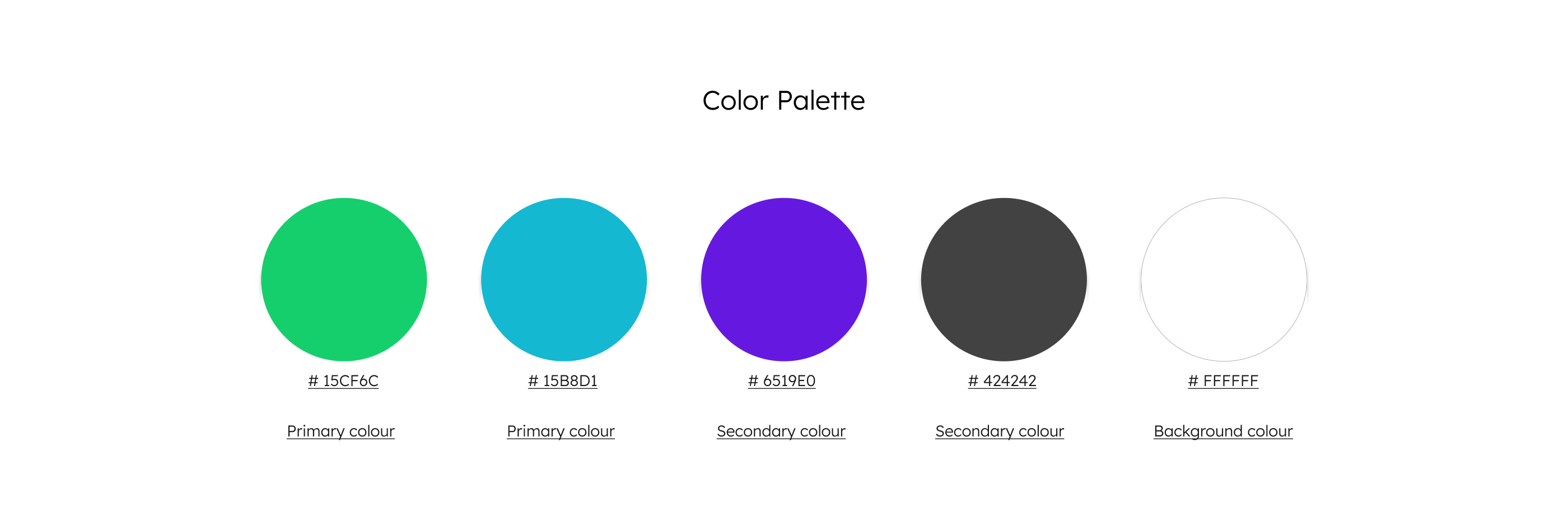
The primary colors are emerald and pacific blue. Emerald is a color of abundance, prosperity and growth. It transmits the energy of life, the peace of nature, renewal and stability. Pacific blue communicates creativity and intelligence. It stands for loyality, strenghts, wisdom and trust.
The secondary colors are purple heart and black panther. Purple heart stands for support and close bonds. Black panthere is linked to feelings of protection and saving.

Icons
The chosen icons are meant to make the navigation through the app easier. They communicate the user where he/she can find what they are looking for.
Final UI Design
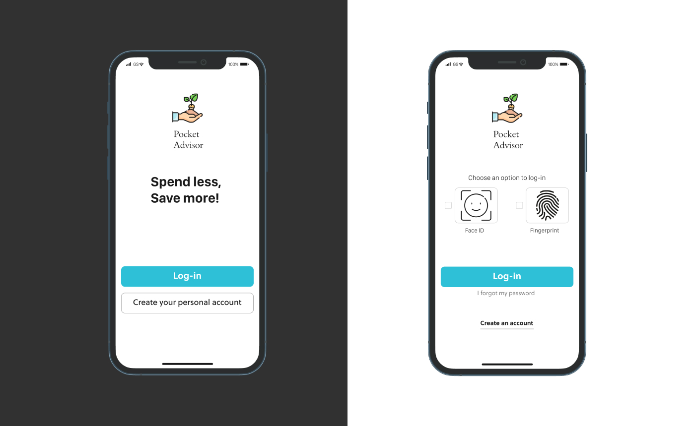
Onboarding & Securitized Sign-in and Sign-up
On the Onboarding screen, the user can log-in to his/her account or create an account if he/she doesn't have one. To sign-in or sign-up, the user is asked to identify himself with the face ID or digital fingerprint. It gives the user trust that his/her bank details are safe.
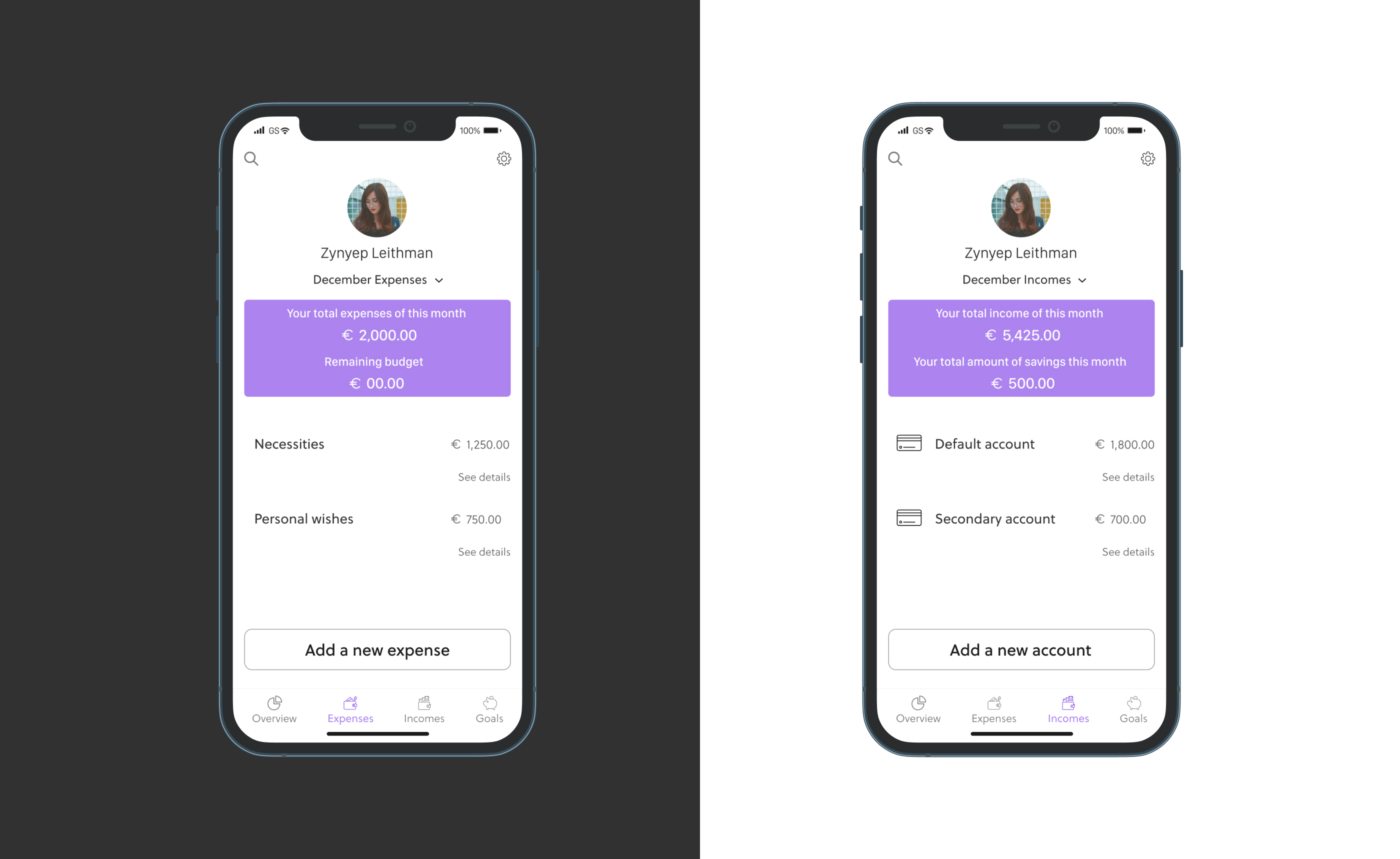
Know All the Details About Your Expenses & Incomes
With the Pocket Advisor you can learn everything you need to know about your expenses and incomes with just one click.
Dashboard & Setting Saving Goals
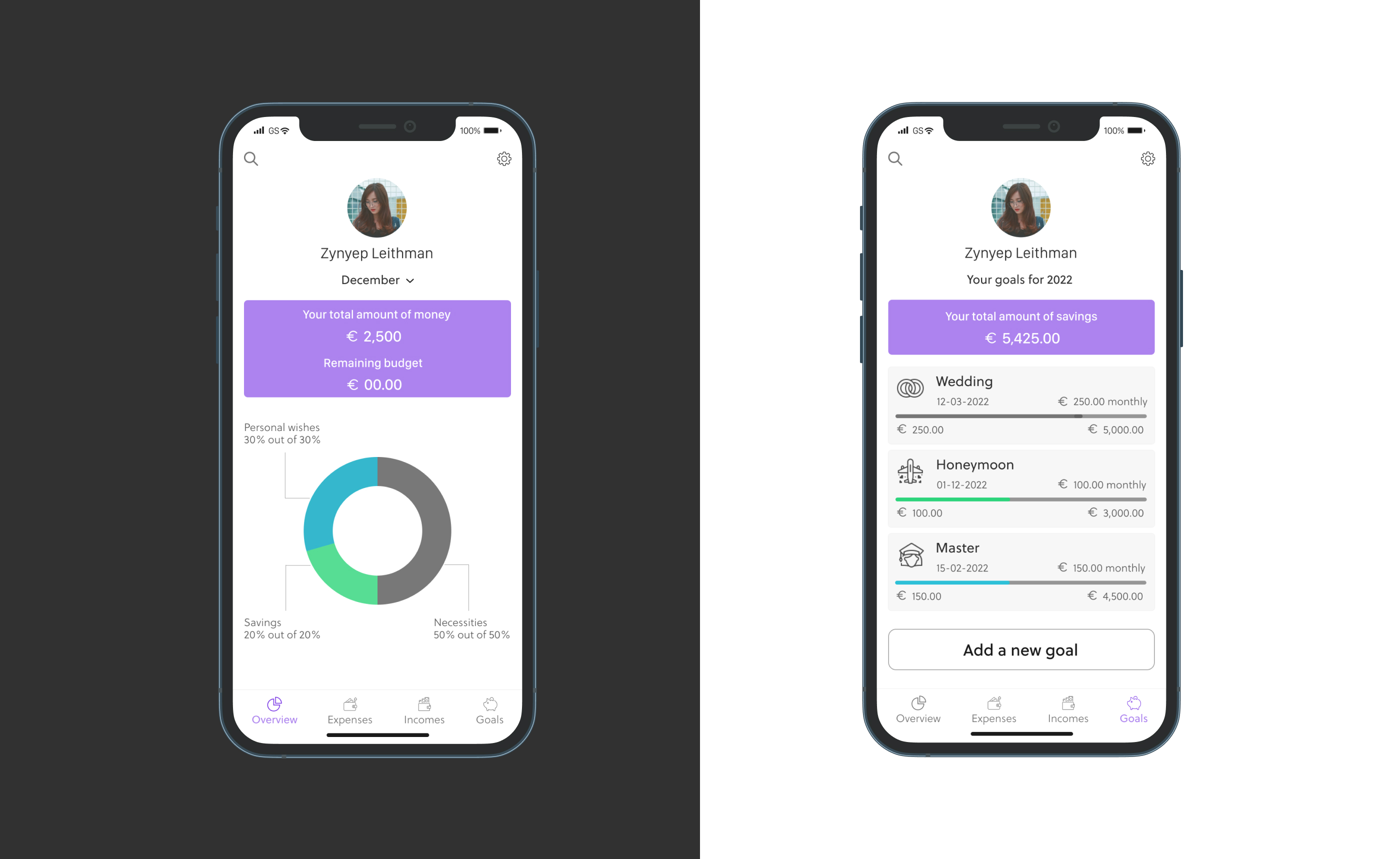
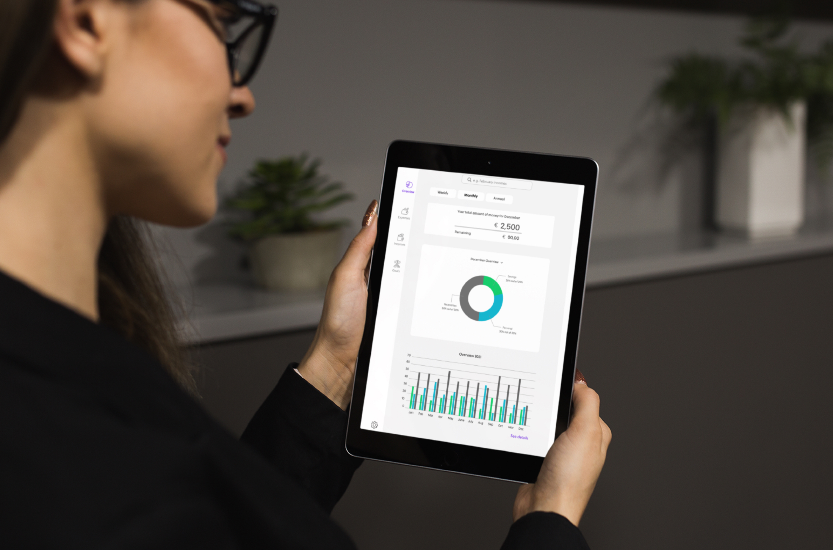
See an overview of your monthly incomes, expenses and savings. Set new saving goals.
Learnings
#1
People need safety reassurances when it comes to their finances
People are skeptical when it comes to introducing somewhere their bank details. That's why a digital product in fintech should insure the user that it is safe to use. One of the biggest learning was to not regret the time spent on concepting and creating a design that makes your user trust your product.
#2
Users do not always imagine the product as we do
One of the most important lesson I learnt doing this project is that the designer is not his user. He/she may think about a project in a way and change completely his/her way of thinking after looking the real user interacting with the product. While we create and work on design concepts, we should always let some room for a potential change of direction after user testings.
#3
Simplicity in design looks elegant and professional
After testing with users the first version of design screens, I realized that users prefer simple and functional design for a financial app. With a simple, clear and elegant design it's easy to understand what the main functions of the product are and what each function does.
