Easy Cooking Case Study
Introduction
The number of recipe products available on the web is astonishing. Yet the experience of finding recipes that work for anyone in different scenarios can be overwhelming. Perhaps the ingredients aren't available locally, or they are too expensive. Some of the recipes take too much time and the instructions are impossible to follow and/or the reviews are terrible.
Whatever the dilemma is, the fact is that there is a large number of recipe products out there that do not meet the needs of their users. Creating a web app that meets all these needs and solves some other important issues is more than necessary.
The Challenge
Design a responsive web app for recipes that meets the needs of its users and solves the problems they are facing with existing recipe apps.
The Solution
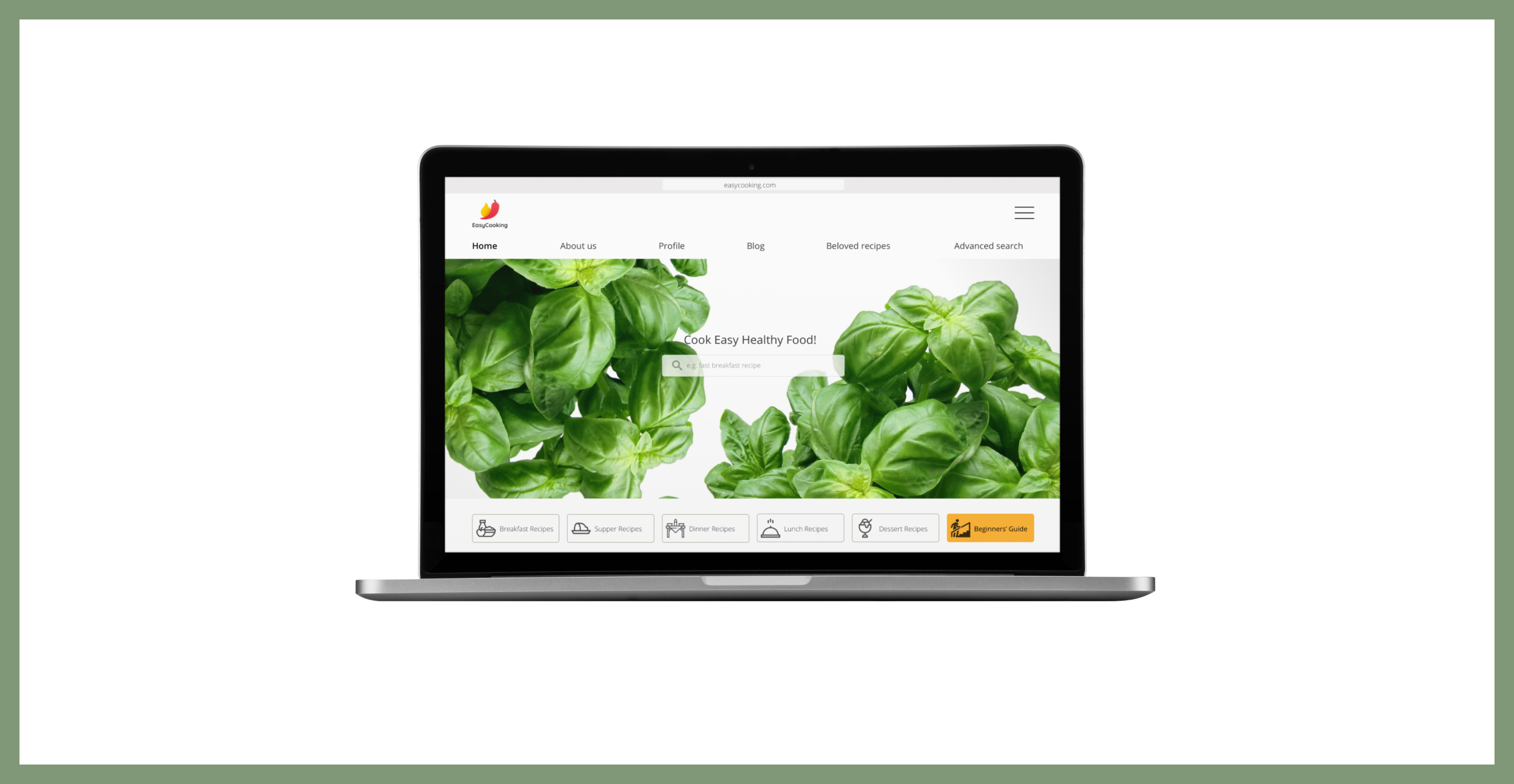
Easy Cooking is a responsive web app where the user can find easy recipes to use at any time of the day! The recipes are accessible to everyone. The user has the opportunity to order local ingredients from local markets.
My Role
UX Design Process and Approach
- Implementing the User Centered Design process and Design Thinking process
- Applying the mobile-first approach to responsive web app design
- Following the principles of Lean UX to design process
- Prototyping rapid techniques used for early user feedback
- Conduct competitor analysis
- Conduct user research interviews
- Conduct usability testing on mobile prototype
- Create user personas
- Elaborate a MVP document
- Build a user flow diagram
UI Design Process and Approach
- Establish a visual direction of the product
- Conduct a preference test of two different UI styles
- Apply the responsive design patterns
- Engage in a "crit" session with the users
- Apply the feedback to designs
- Create a mood board
- Establish a style guide
- Create low- to mid-fidelity responsive designs for the web app screens (XS, S, M, L)
- Generate the final mockups for responsive designs, all screens and all breakpoints
The Design Process
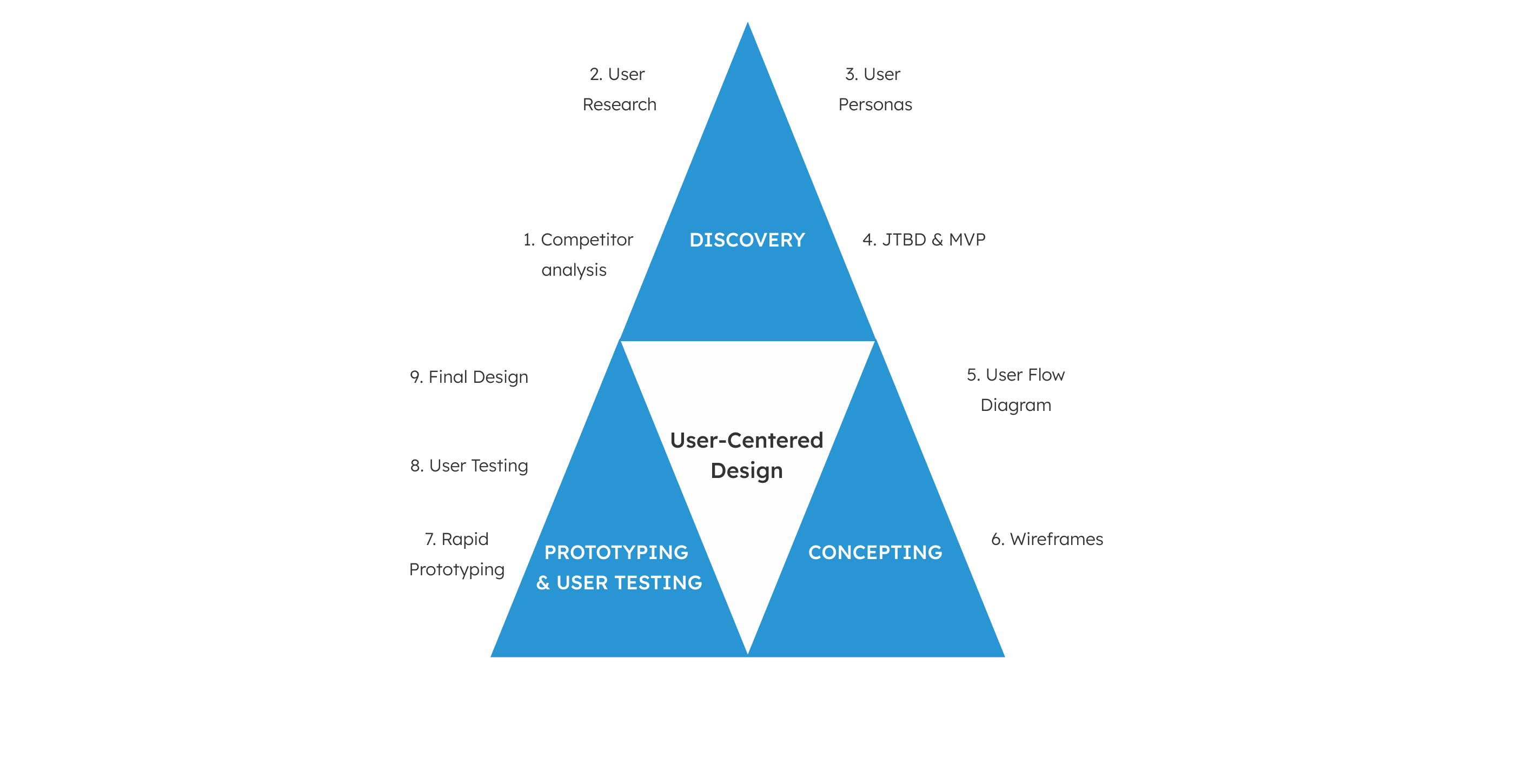
The design process has been broken down into two phases: UX Design phase and UI Design phase. Both phases followed the steps of User Centered Design and the Design Thinking process.
Discovery
Competitor Analysis
At this phase I analyzed the competitors through user psychology. I evaluated design principles, patterns, user behaviors which the competition uses to keep the users engaged. This helped me shape a concept of the design I intend to create.

Main insights
- Applying the Hick's Law helps the user to take a decision easier.
- A personalized approach makes the user feel unique and special.
- Creating the design based on "Operant Conditioning and Addiction" pattern can make the user feel "punished" if he/she doesn't agree to accept to take the call to actions.
- Using Dark Patterns in design can determine the user leave the app/website and never come back.
- Creating trust and focusing on the user personality is one of the most important ways to create a good user experience.
Conducting User Research
After analyzing the competition, I conducted user research through the Research Learning Spiral.
STEP 1: Setting the objectives (5W's)
Who are you designing for?
I am designing for 30 to 38 year old people who enjoy cooking using a cooking web app/website. The user I am designing for is not afraid to try new recipes.
What kind of tasks and goals will your audience be accomplishing as they use your website or app?
The user will learn to cook fast and healthy food. The user will have the opportunity to learn about what he/she is cooking. The user will explore new recipes with accessible ingredients in the local markets.
When will your audience be engaging with your product?
The user can use the web app at any time of the day, when he/she decides to cook.
Where will your audience be using what you are designing?
The user can use the web app anywhere.
Why is your audience choosing to use what you design?
The user will choose namely the web app I am designing because he/she can discover that cooking healthy food doesn't necessary need to take a lot of time. He/she might find out that cooking can be a joy, not a burden!
How will your user accomplish his/her goals?
The user will be able to find the most important functionalities of the web app easily and access them.
STEP 2: Formulating a hypothesis to use as a foundation of the research
Cooking healthy food doesn't need to take more time than fast food.
STEP 3: Conducting user interviews to get a sense of potential users
On this stage I formulated sets of questions regarding the cooking behavior of the potential users. I then conducted user interviews with seven users between 30 and 38 years old.
Question Set 1:
How often do you cook?
Do you eat more fast food or home cooked food?
Question Set 2:
Where are you getting your recipes?
Question Set 3:
Most of the times, do you cook alone or with some company?
Question Set 4:
Do you always cook the same recipes or you like exploring new ones?
What exactly do you like to cook the most? Why?
Question Set 5:
What was the last online resource you used to get a recipe?
What did you like about it?
What didn't you like about it?
What features do you think a useful cooking app/website should contain?
Question Set 6:
Where do you buy the ingredients for your cooking?
Why exactly are you shopping there?
STEP 4: Analysing the patterns, frustrations, needs/goals of the users. Synthesising the feedback
Common Patterns
- All the users I interviewed cook daily
- They all get inspiration from online websites or web apps
Frustrations with the Actual Cooking Web Apps
- Either the description of the recipes is not clear or it's too complicated
- Unstructured content, too much information without clear categories
Needs/Goals
- A clear categorization of recipes
- Attractive imagery
- Search suggestions
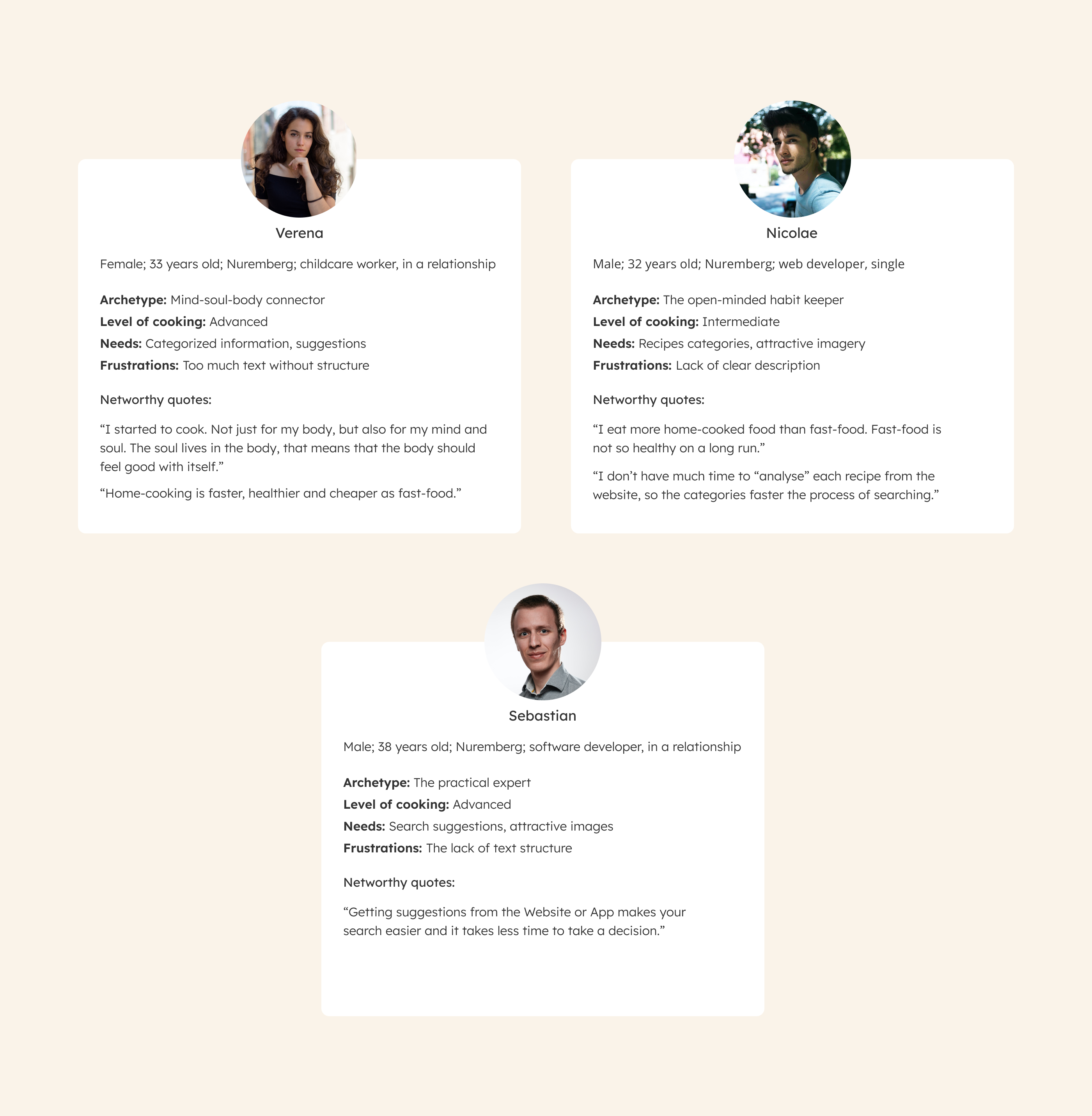
Creating User Personas
Based on the information I gathered from the user research, I created user personas.
Establishing a MVP and the JTBD
After designing user personas and defining my users, I started considering business requirements and breaking down the big goals into milestones.
Minimum Viable Product
Feature Requirements
- Clear, well-organised search and navigation through the web app
- Leave, read comments and reviews
- "Go back" to Home screen
- Cooking for beginners category or a separated functionality on the Home screen
Success Metrics
- Number of Sign-ups
- Level of user engagement
- Time spent on the web app
- Types of reviews, comments and ratings
- Numbers of views per post
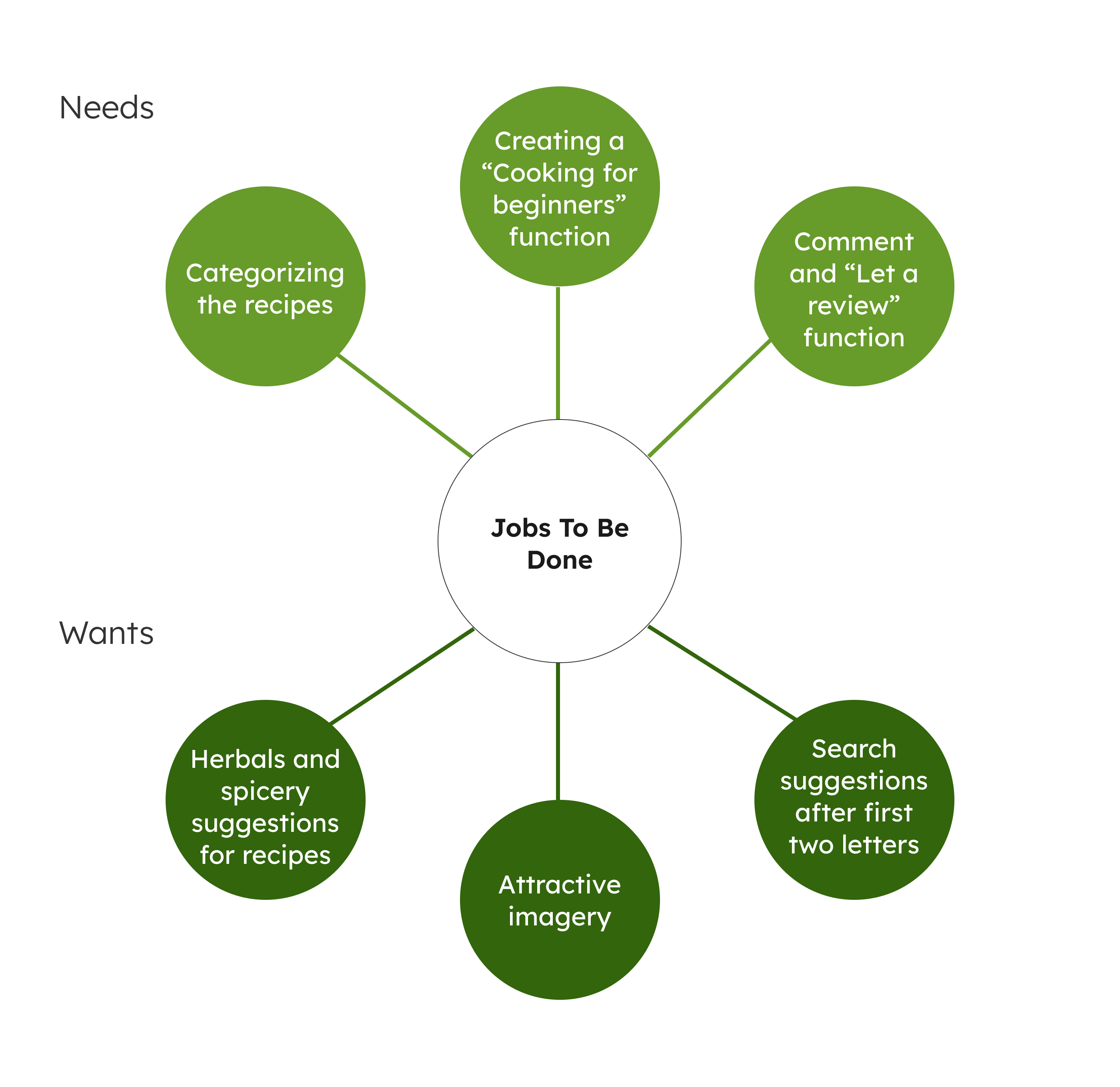
Jobs To Be Done
Concepting
Creating the User Flow Diagram
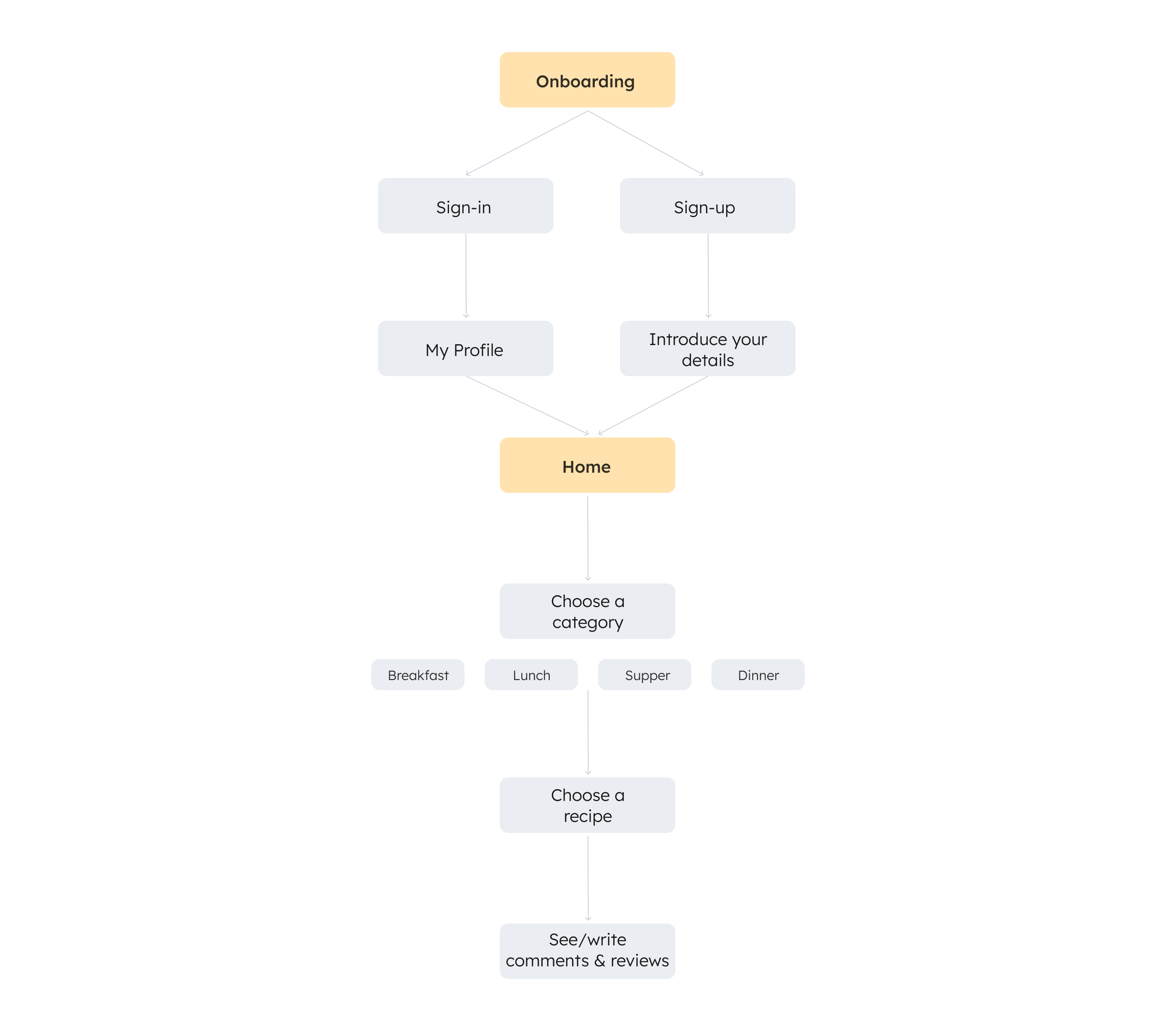
At this stage, I created a user flow for each of the user stories. Each user flow had an entry point and a success criteria. Based on the user flows, I built the final user flow diagram.
Wireframes
At this stage I had everything I needed to start sketching design solutions. To do so, I used the Crazy 8s methodology to generate ideas for the user flows in my user flow diagram. After doing this, I "dot voted" the most viable design solutions from my sketches. Then I organized my drawings to follow a linear user flow.

Prototyping & User Testing
Prototyping and Conducting a Usability Test
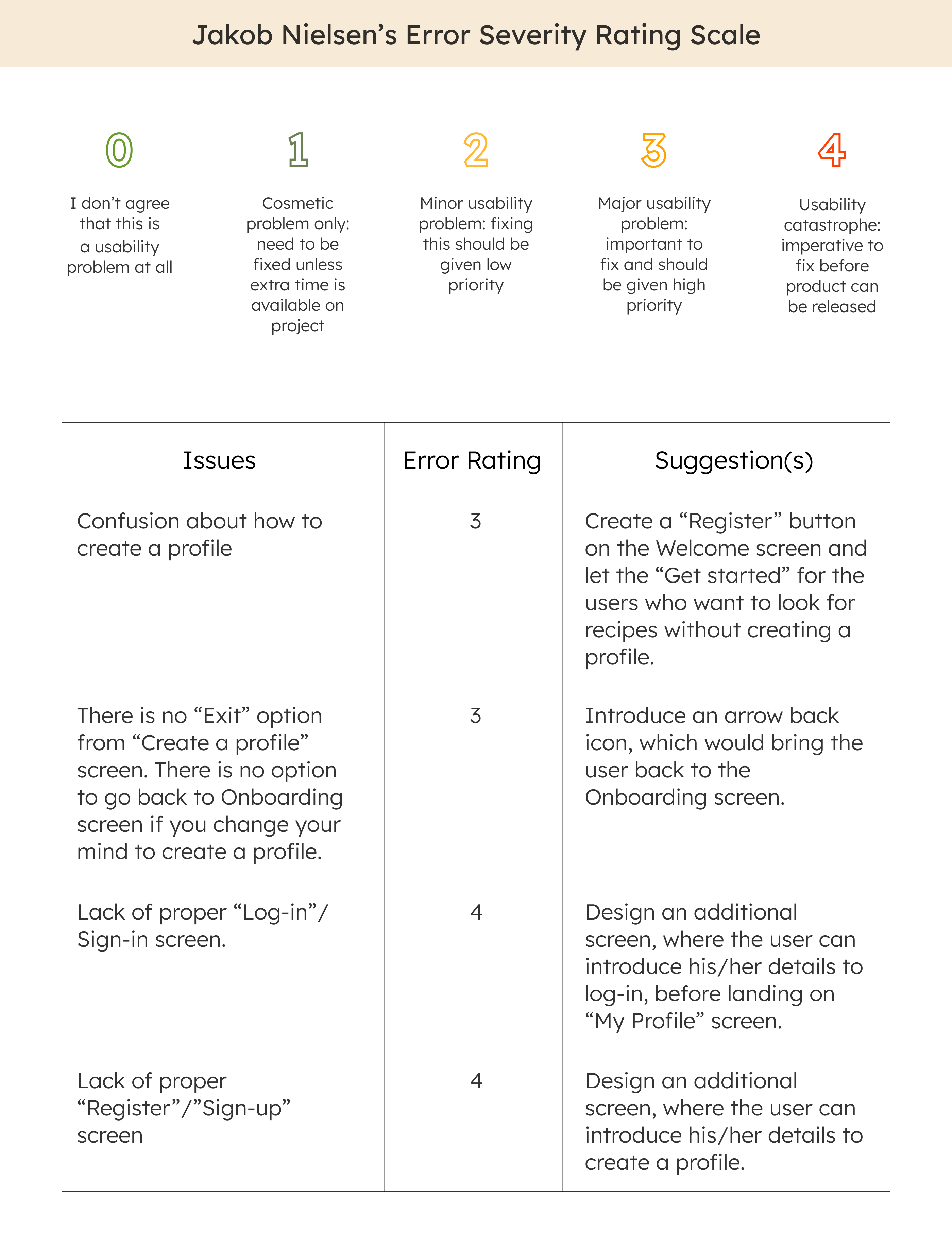
After sketching the low-fidelity wireframes, I wrote a usability test script and conducted usability testing with five participants. I tested the main functionalities of creating a profile, sign-in to your profile, search for a recipe and reading and writing a comment or review. I analyzed the results of the test through using Jakob Nielsen's error severity rating system. I proposed solutions for my design issues based on the test results.
User Interface Design. Building a Mood Board
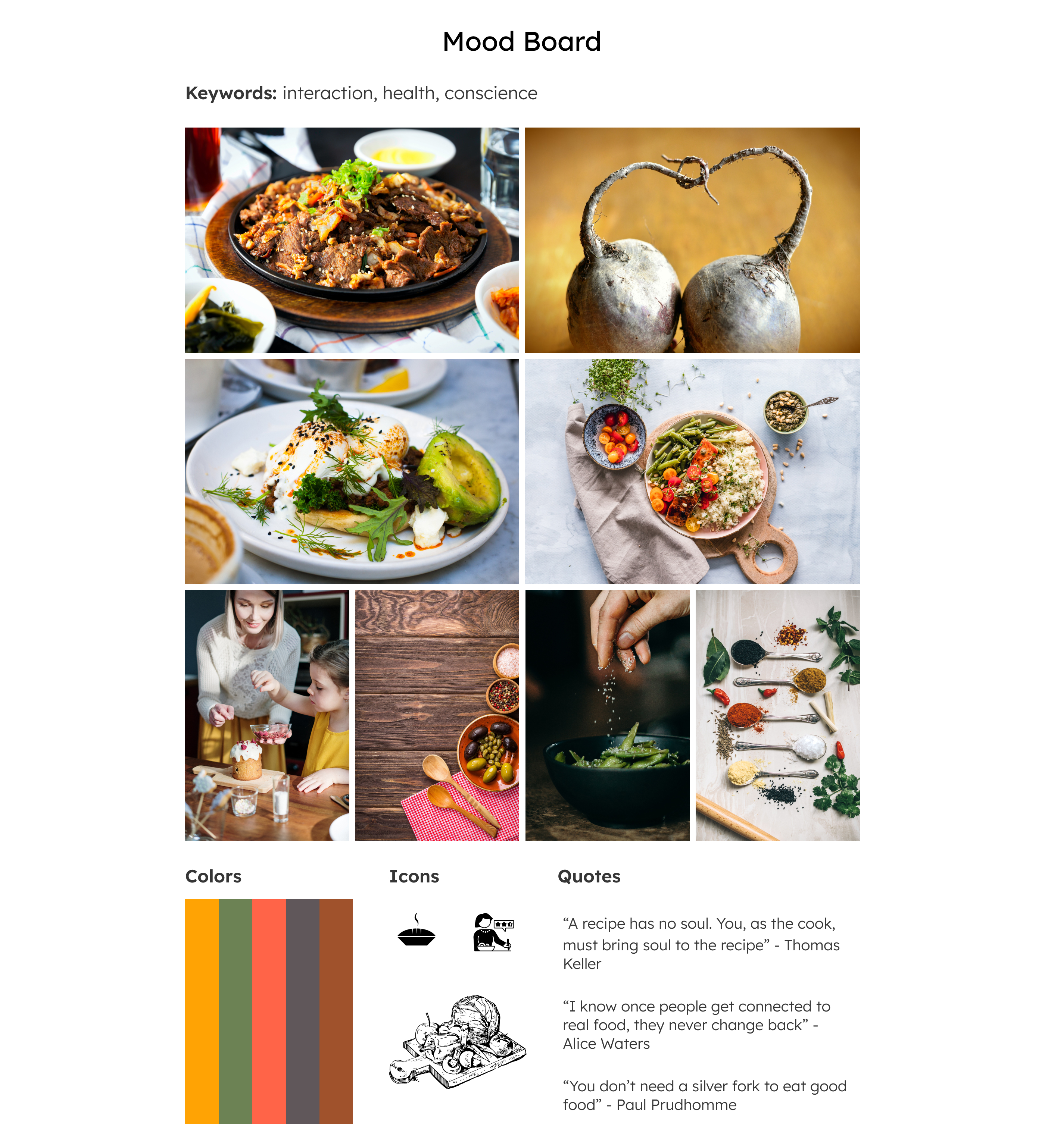
After finding more sources of inspiration and refining my findings, I used them to develop a visual direction for the future product and I built a mood board to communicate it.
Conducting a A/B Preference Test
The next step in the process was to create a complete mockup of the Onboarding screen, consulting the mood board. I created a variation of this screen, using different images for the two versions of the screen. After that I uploaded the design variations on the UsabilityHub, labelling each of them clearly. I waited to have minimum ten results to analyse which of the versions the participants prefer.
Creating a Style Guide
Before designing the high-fidelity wireframes, I created a style guide for the product and brand.
Color Palette
The colors associate the product with earth (brown) vitality and health (orange, red, yellow), renewable energy and organic products (green).

Typographic Style
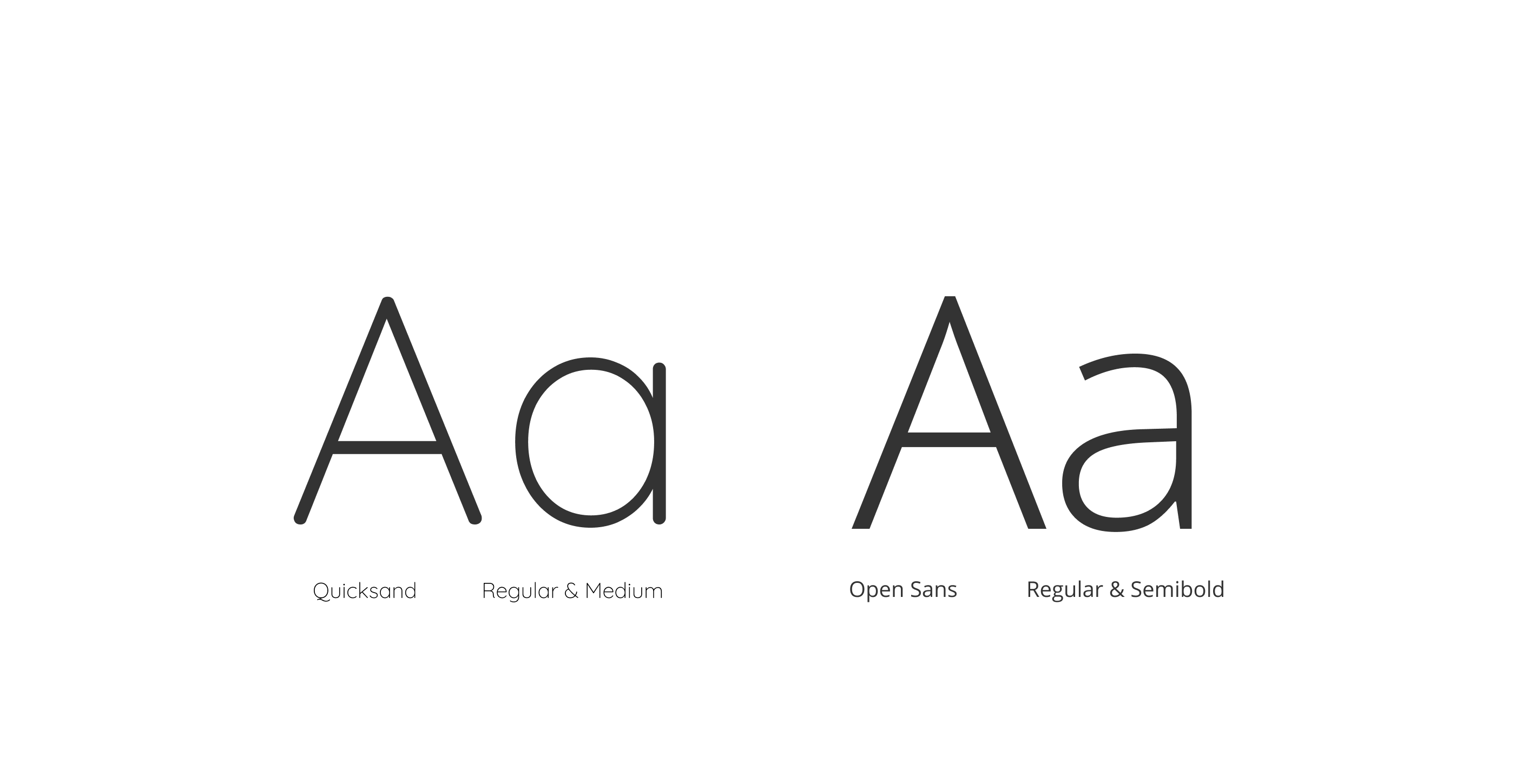
As typefonts, I chose Quicksand in combination with Open Sans. The reason I chose Quicksand is because it creates a feeling of novelty, approachability and openness. This is what the product aims to express. Open Sans has excellent legibility, is clean and has a friendly approach. It fits perfect the brand value, of giving the product an approachable aspect. Together they give the product a modern and gettable look.
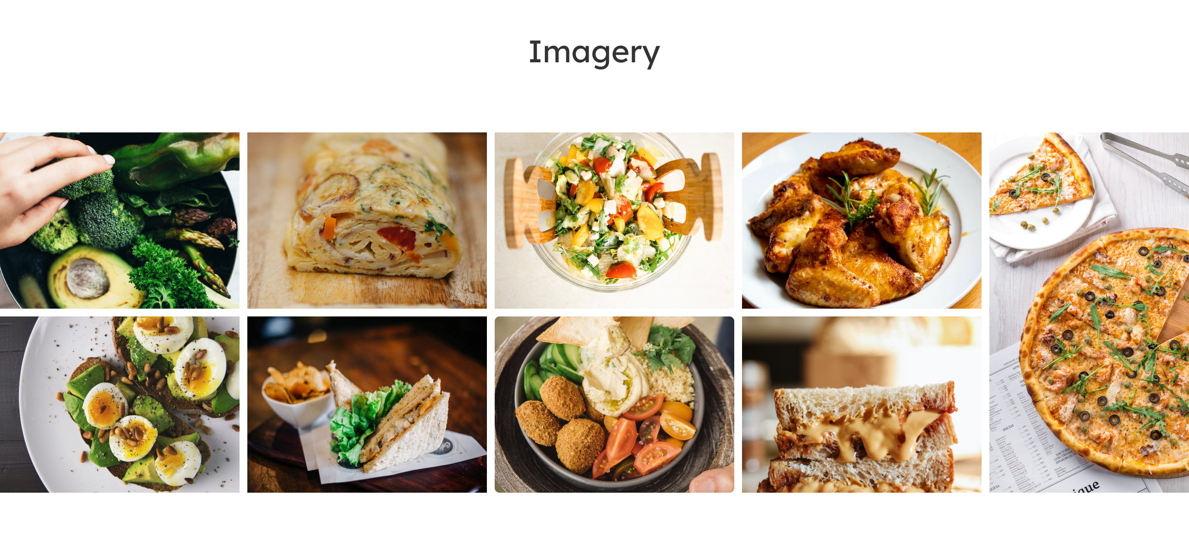
Imagery
The pictures contain vivid colors related to earth, vitality and health, renewable energy and organic food. They have a good resolution on all the XS, S, M and L screens.
Icons
All the icons look like they belong to one family. They give clear instructions about navigating through the app.

Buttons
The buttons have a simple and clear look. Their default state differentiates from the hover state.

High-Fidelity Wireframes & User Feedback
I applied the Style Guide to the User Interface design for the responsive screens. After doing that, I invited five potential users to review my work and to provide feedback. I organized the feedback into two lists: one for constructive comments and one for positive comments.

Final Mockups After Implementing the Feedback
After receiving reviews and critiques from the testers, I updated the screens and created the final mockups.
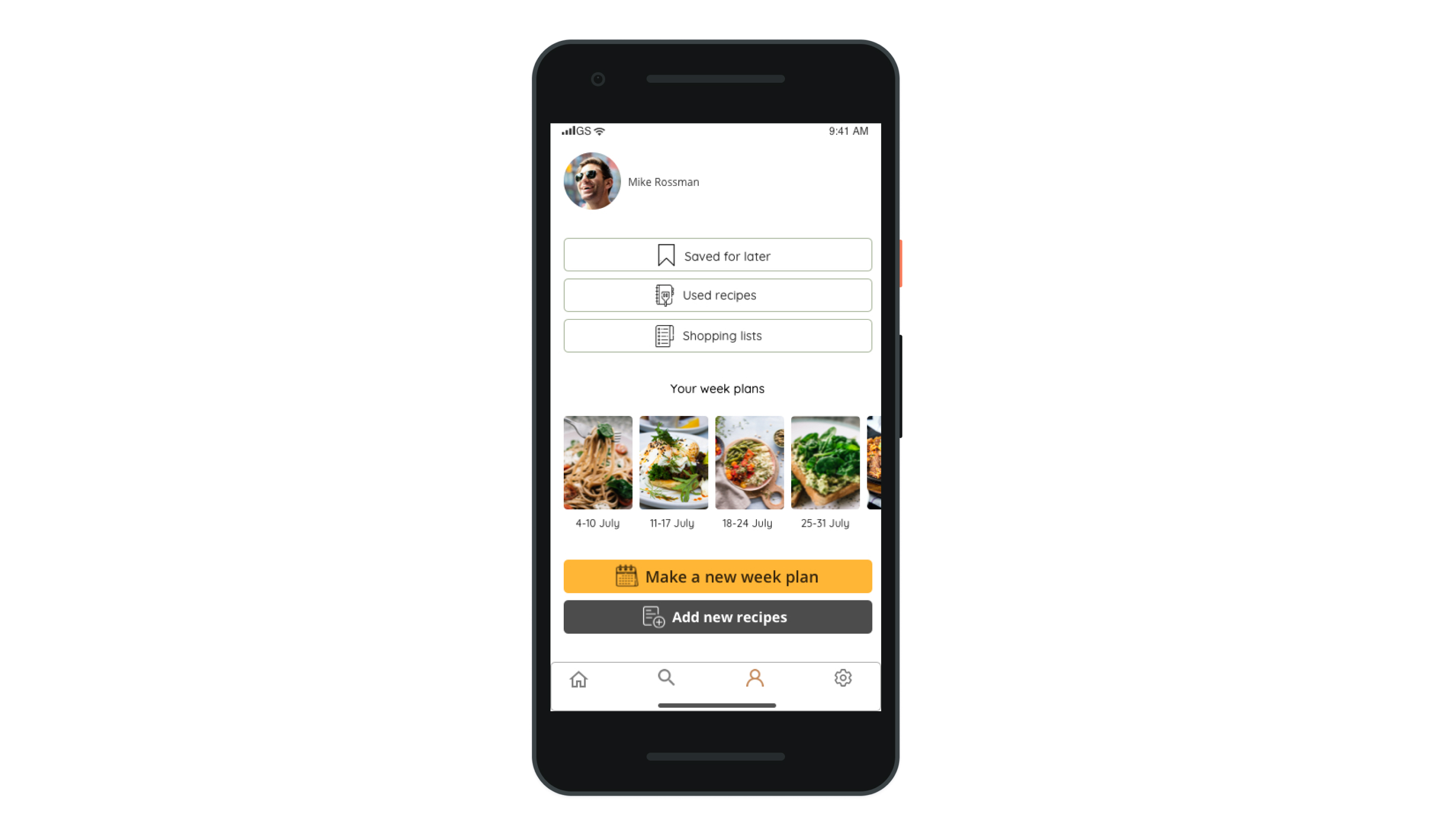
Personalized Profile
The profile screen shows the user his/her activity. The recipes he/she saved for later, the recipes he/she already used, his/her shopping lists and week plans.
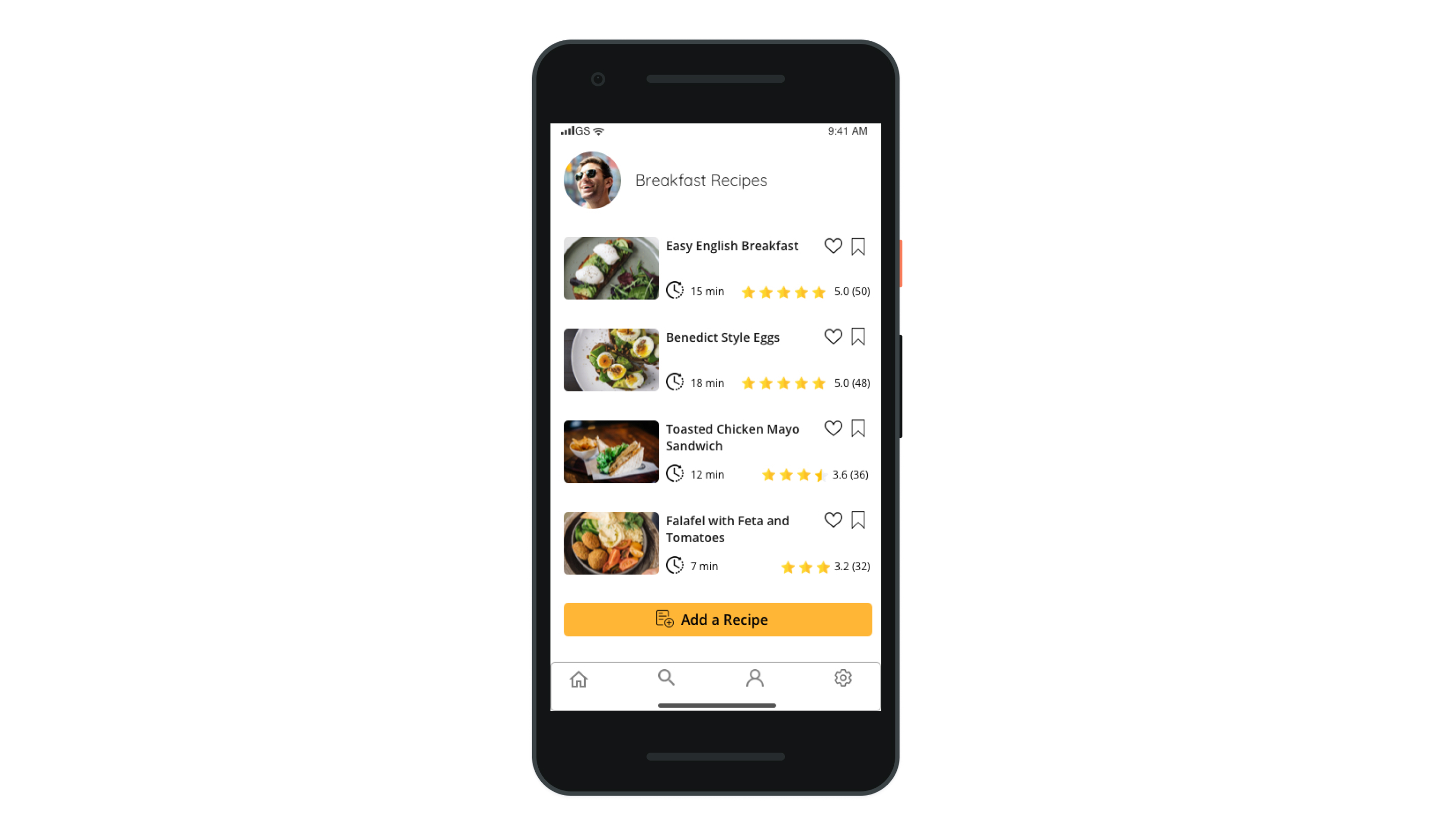
Categories
Choosing a category from the Home screen, the user has the possibility to see how much time each recipe takes and how it is rated by other users.
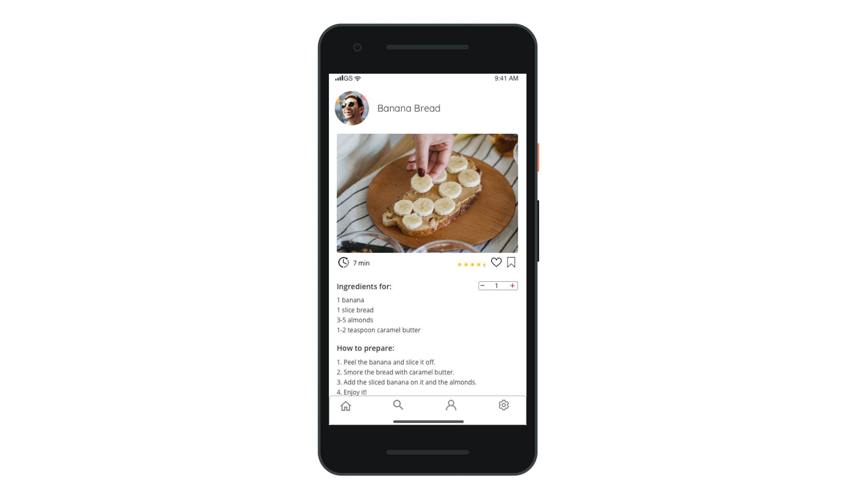
Recipe Screen
On the Recipe screen, the user gets clear, organized details about how to prepare it.
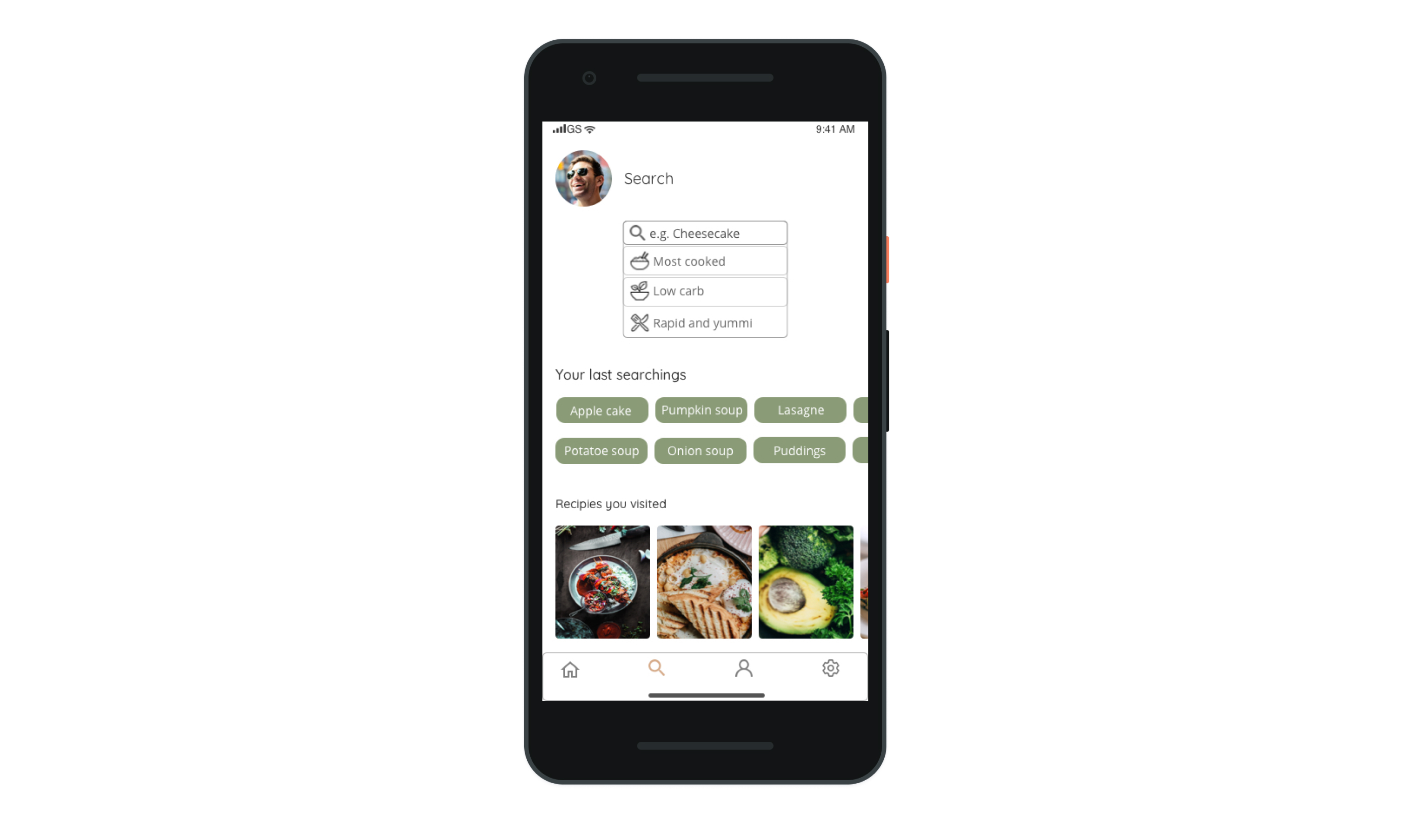
Search Screen
The search is personalized for each user. The user can find suggestions when he/she is not sure what to cook.
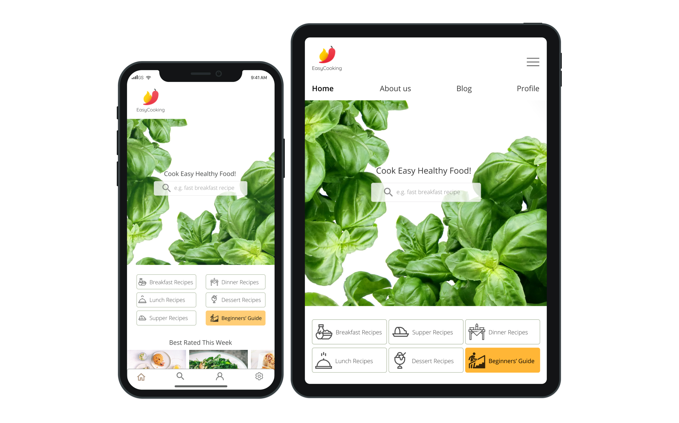
Home Screen
On the Home screen, the user can see the categorized recipes and a guide for the beginners.
Learnings
#1
Testing at Early Stages Help You Shape the Design Direction
Testing more and earlier is essential for the future of a product. Users' feedback helps the designer to solve and prevent small functionality problems before they become big ones.
#2
Users' Feedback Can Change Our Perspective, but Not the Whole Direction
After getting feedback from the users, the designer can feel sometimes that the direction the product takes is totally wrong. It doesn't have to be so. I think we as designers should always keep in mind the customers' requirements, but be flexible about the perspective we have to approach the problem.
#3
Concentrate Your Design on Functionality
If you have to give up on some "decorative" element in your design to make it functional, do it! Nobody needs beautiful, but unfunctional products.
#4
Have Some Fun on the Way
Meeting the deadlines is important, but also taking time in between to enjoy the process is a good practice. From time to time we need to detach ourselves to see new perspectives.
