Connecting Ideas Case Study
Introduction
Context and Purpose
The idea of creating a native app for the teachers and educators came from my background in pedagogy. After more than six years experience of working with children, I came to the conclusion that the most difficult part of the working day for a pedagogue is to win the control over the group of children again when they look for new challenges. Finding rapid pedagogical ideas in these situations is not an easy mission. The purpose of Connecting Ideas is to help teachers and educators to find rapid daily inspiration for their job and to create a community to support each other.
The Challenge
Design a mobile app for iOS and Android that solves a specific user problem. Come up with the concept, app name, objective, brand logo, competitive research, potential users and key features.
The Problem I Want to Solve
The need for finding rapid pedagogical ideas and the need for creating a community.
My Role
- Understand and define the problem
- Conduct a competitor analysis
- Come up with the product features and a user flow diagram
- Follow the native design patterns (for iOS and Android)
- Create wireframes and prototypes
- Conduct user testing and implement the feedback
- Create the visual and User Interface design
The Solution I am Proposing
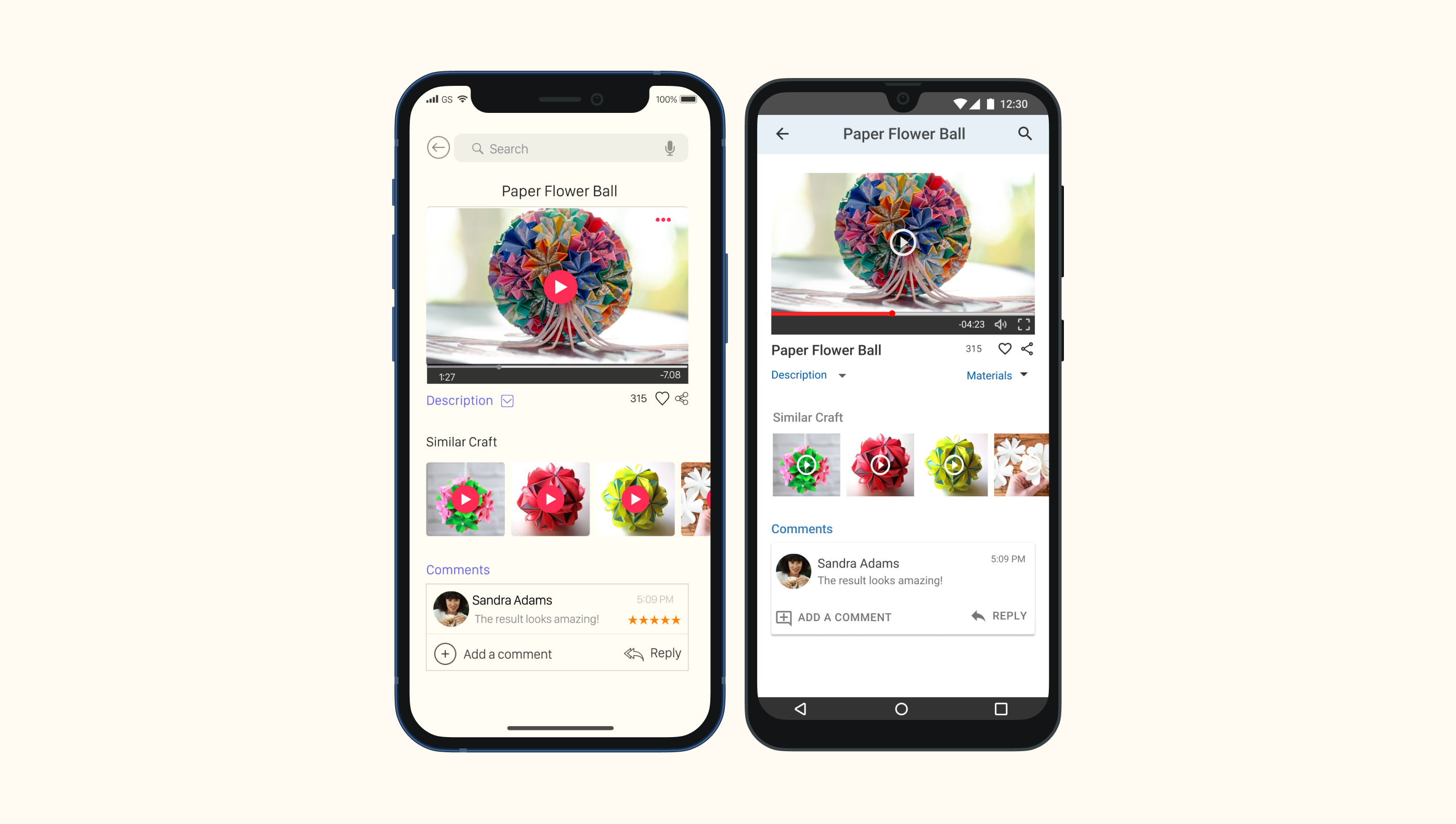
Creating a native mobile app that solves the problem of finding rapid craft ideas for different ages of children to keep them occupied. The app has a specific feature called "Rapid craft ideas" that makes it stand out from the other competitors.
Discovery
Setting the Objectives
At this phase I set up the objectives of the project using the 5W questions.
Who is the app for?
The app is for the teaching staff who looks for daily inspiration in their work with children.
What kind of tasks will users complete as they use the app?
Users will be able to create a profile (with the specification about the age of children they are working with), to share the ideas they like, to search for ideas of all levels of difficulty, to review and comment others' ideas.
When will the audience use the app?
Users can use the app before preparing for a new working day or in difficult parts of the day, when they should come up with new ideas to keep the group occupied.
Where will your audience use the app?
Users can use the app everywhere: at home, at work, in public transport or on their way to work.
Why is your product more suited to a native mobile app than a responsive web app?
My product is more suited to a native mobile app because it's more convenient to use. Its' main characteristics are: easy to use, accessible everywhere, and always at hand. It is meant to be a "pocket assurance" for the teaching staff in the moment they need to come up with new ideas.
The Design Process
The design process followed the steps of the User-Centered Design.

Competitor Analysis
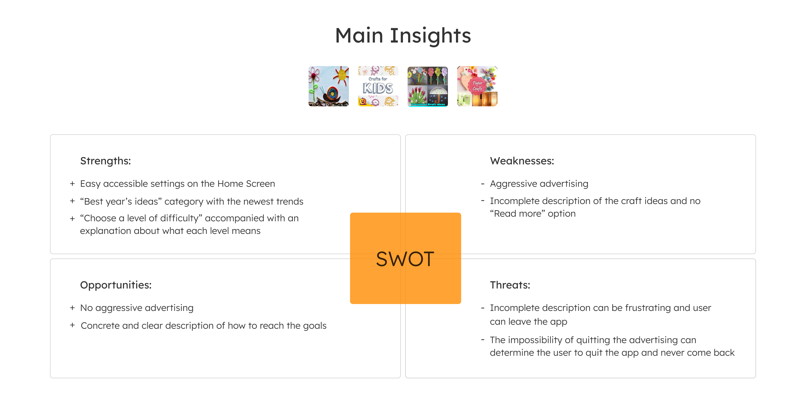
After understanding the problem and setting the objectives of the product, I conducted a SWOT competitor analysis for Kids Craft Ideas, Diy Crafts for Kids, Preschool Craft Ideas and DIY Paper Craft.
Concepting
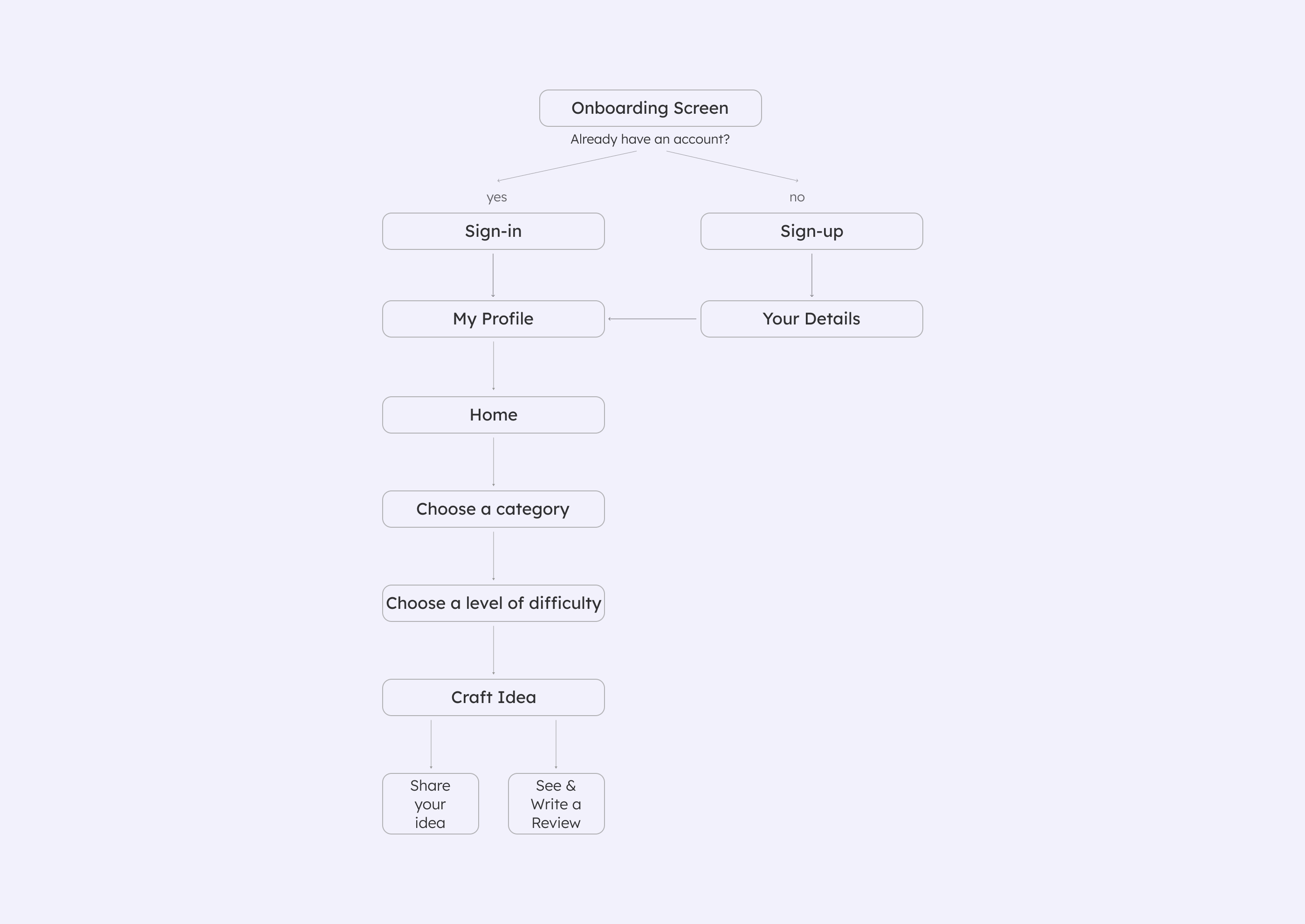
User Flow Diagram
Based on the competitor analysis results, I established the main features my product will have. I integrated these features in an user flow diagram.
Main Features
- Create an account in order to proceed.
- Sign-in if you (as a user) already have an account.
- Choose a level of difficulty for the creative activities you want to perform with the children. Choose between "Beginner", "Intermediate" and "Advanced" level.
- Share you craft ideas with your peers (your community).
- View/ write a comment or review for other craft ideas.
Wireframes
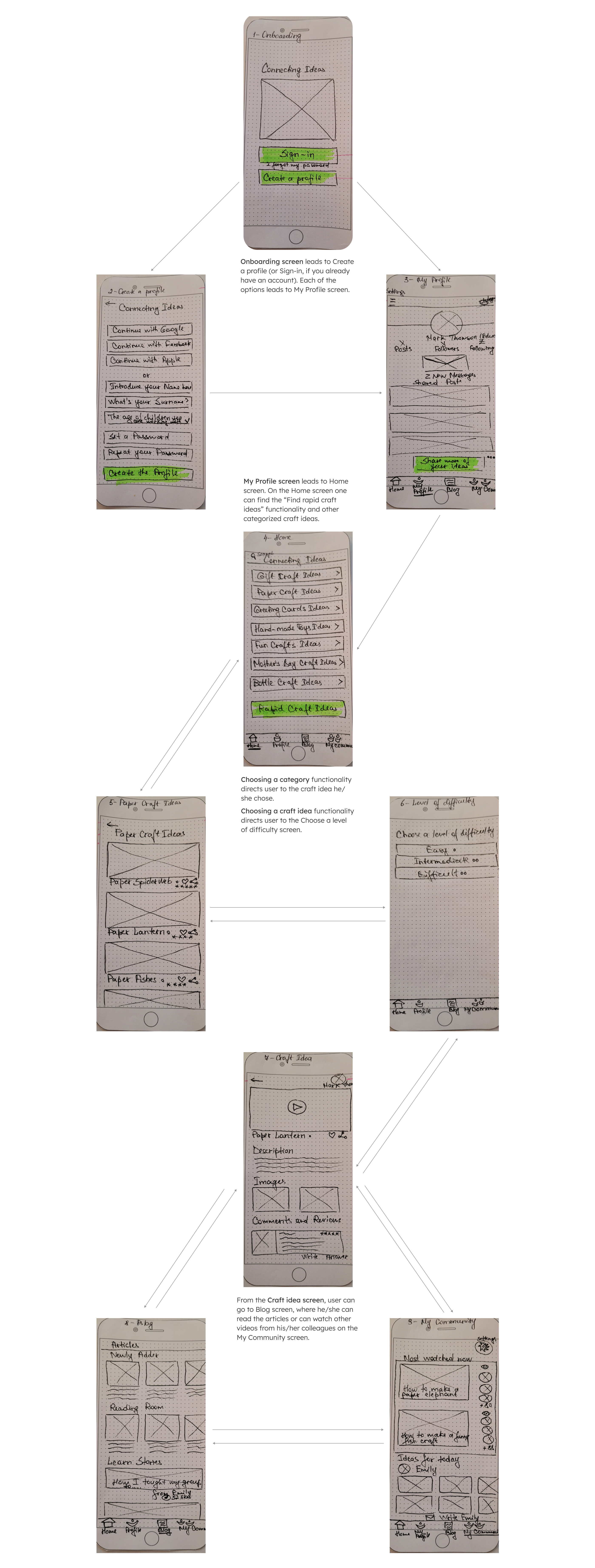
Low-Fidelity Wireframes
To come with a design solution for the main functionalities determined in the User Flow Diagram, I sketched the low-fidelity wireframes.
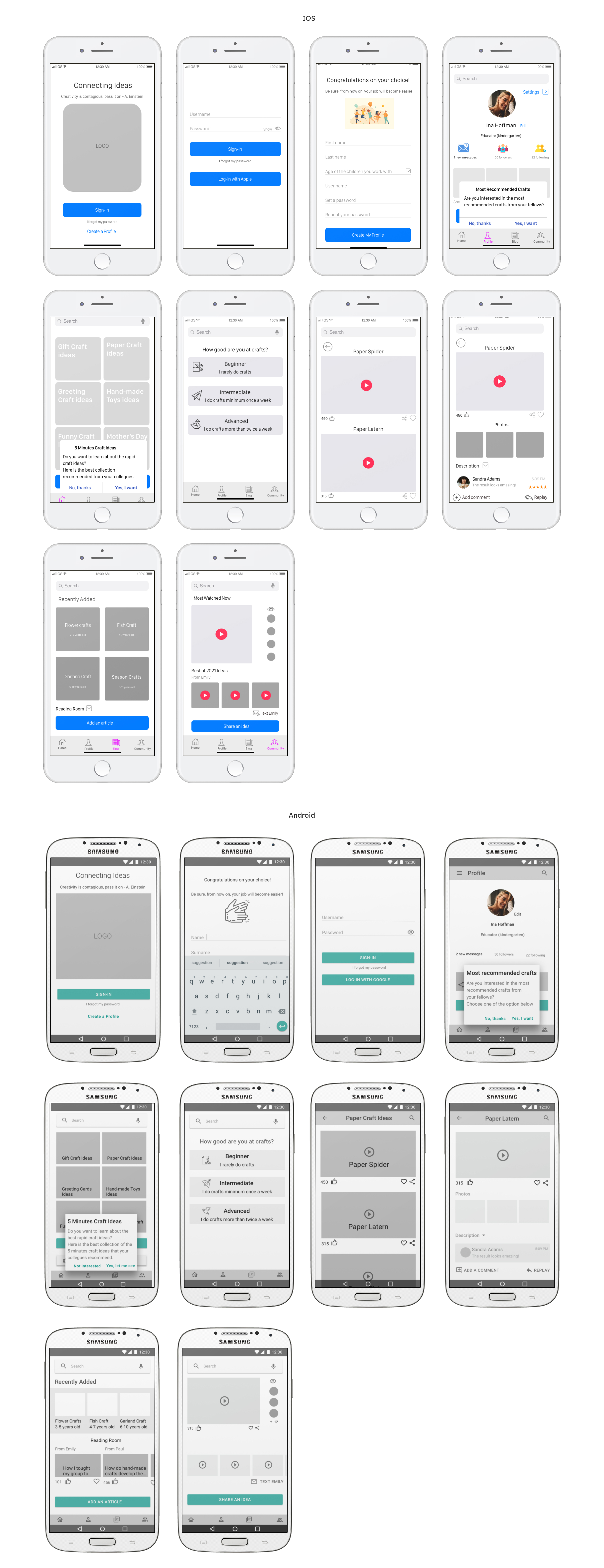
Mid-Fidelity Wireframes
After knowing how the main functionalities will be arranged on the screens, I designed the mid-fidelity wireframes based on the latest Human Interface Guidelines for iOS and Material Design for Android.
Prototyping and Designing
Usability Testing
After creating the mid-fidelity wireframes, I created separate prototypes for iOS and Android in InVision, then I conducted a usability test for each of the versions.
Usability Test Analysis. Main Insights
People are more familiar with the "Sign-up" term, rather then with "Create a profile"
Recommendation
Change "Create a profile" to "Sign-up"
It confuses the user to have two different icons expressing a single functionality
Recommendation
Use either the "thumbs up" or heart icon for the "Like" functionality
It is expected to have a description after each of the craft videos
Recommendation
Introduce a description after each video
Implementing Users' Feedback
After analyzing the user testing results I implemented the feedback into the mid-fidelity wireframes.
Creating a Style Guide
I created two separate style guides for iOS and Android. To ensure consistency on the screens I followed the Human Interface Guidelines and the Material Design for Android.
Color Palette
For iOS I chose blue and orange as dominant colors. As accent color I chose violet and red and yellow as background color.
Blue signifies freedom, intuition, imagination and inspiration. It fits the product's values.
Orange represents warmth, heat, sunshine, enthusiasm, creativity and expression. It is what Connecting Ideas expresses, too.
Yellow is the color of hapiness and optimism. These are the feelings the app tries to give its users.
Violet is associated with nobility, luxury and ambition. Red symbolizes life, love and courage. These are the emotions the product also transmits.
I chose the same colors for the Android version, but I adjusted them to the Material Design requirements. For example, I replaced blue with green and purple with cobalt.
Green is a color of the nature. It represents tranquility and gives a sense of freshness.
Coblat blue suggests richness and calmness.

Typography
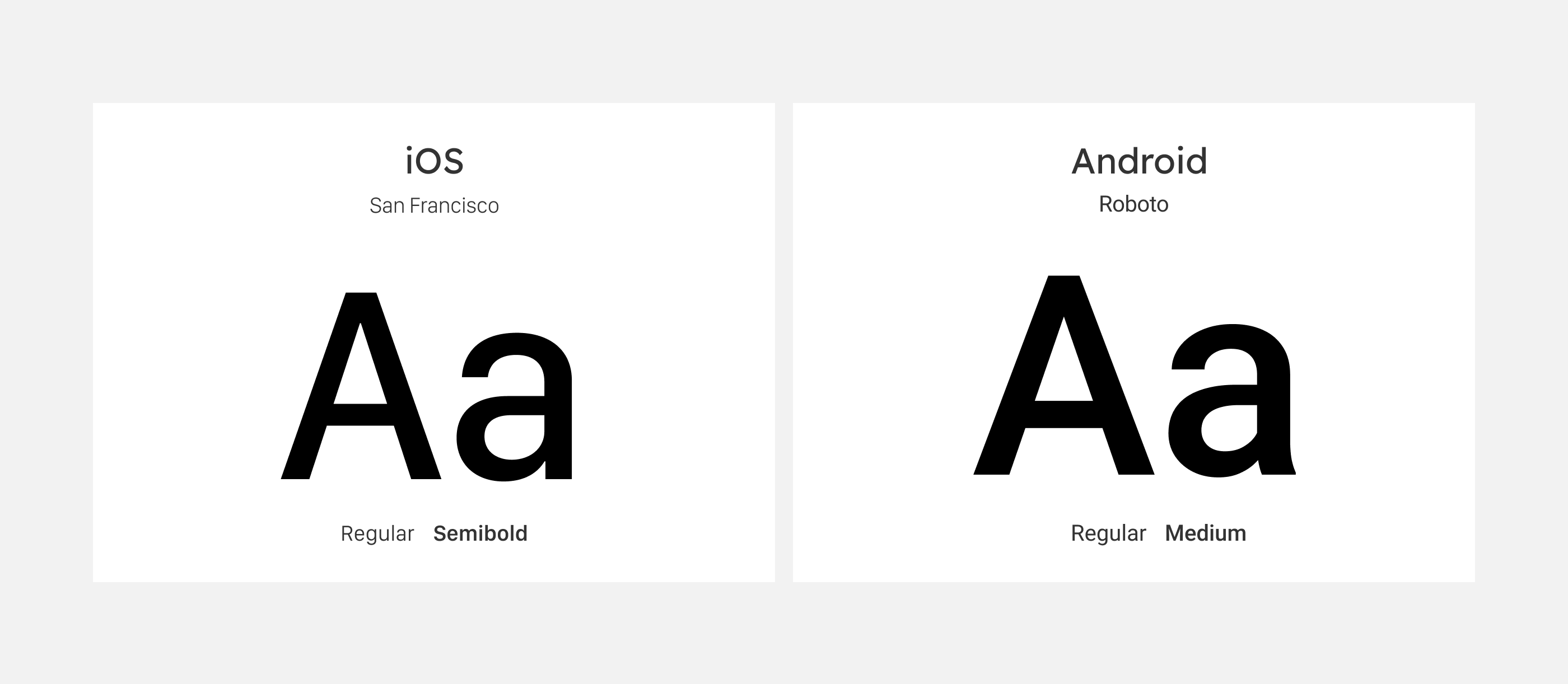
As a typefont for iOS I used San Francisco. This is the required typeface in the Human Interface Guidelines.
For Android, I used Roboto typeface. This is the required typeface in the Material Design for Android native apps.
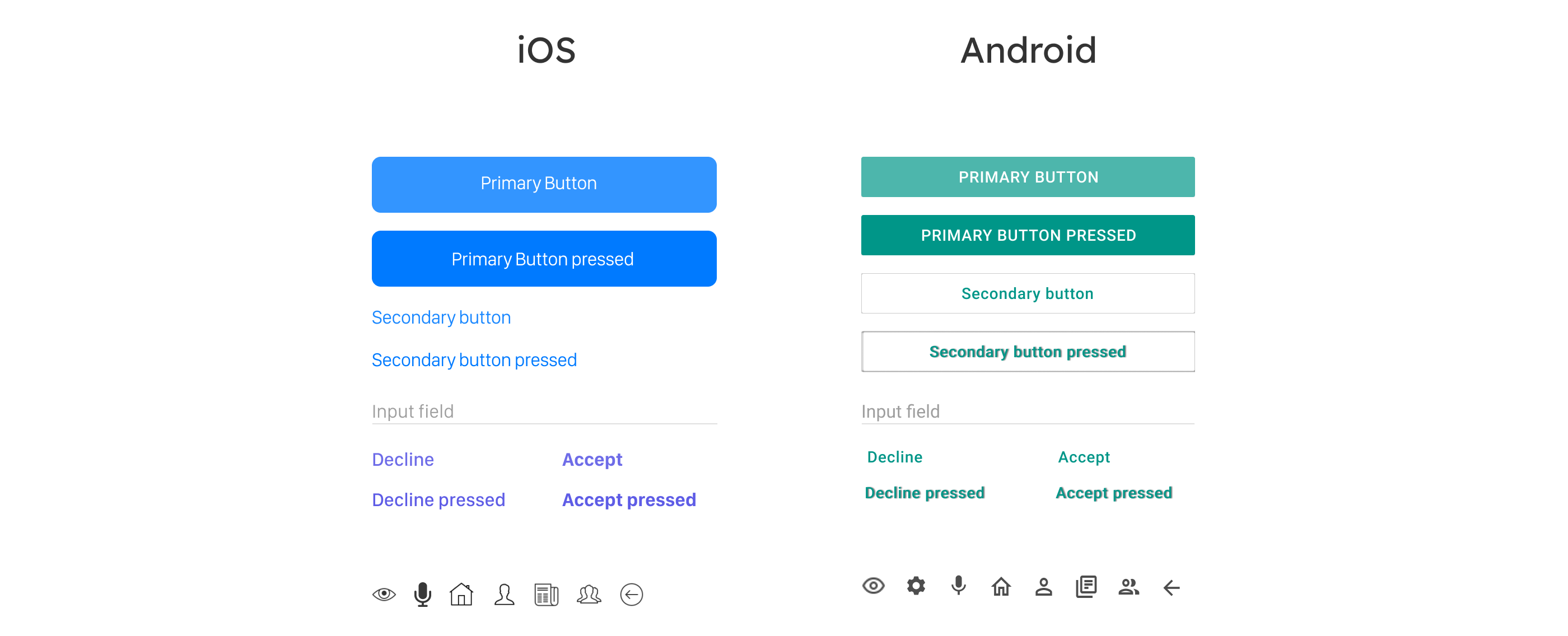
Buttons and Icons
The buttons show a clear pressed and unpressed state. They are designed based on the Human Interface Guidelines for iOS and Material Design requirements for Android.
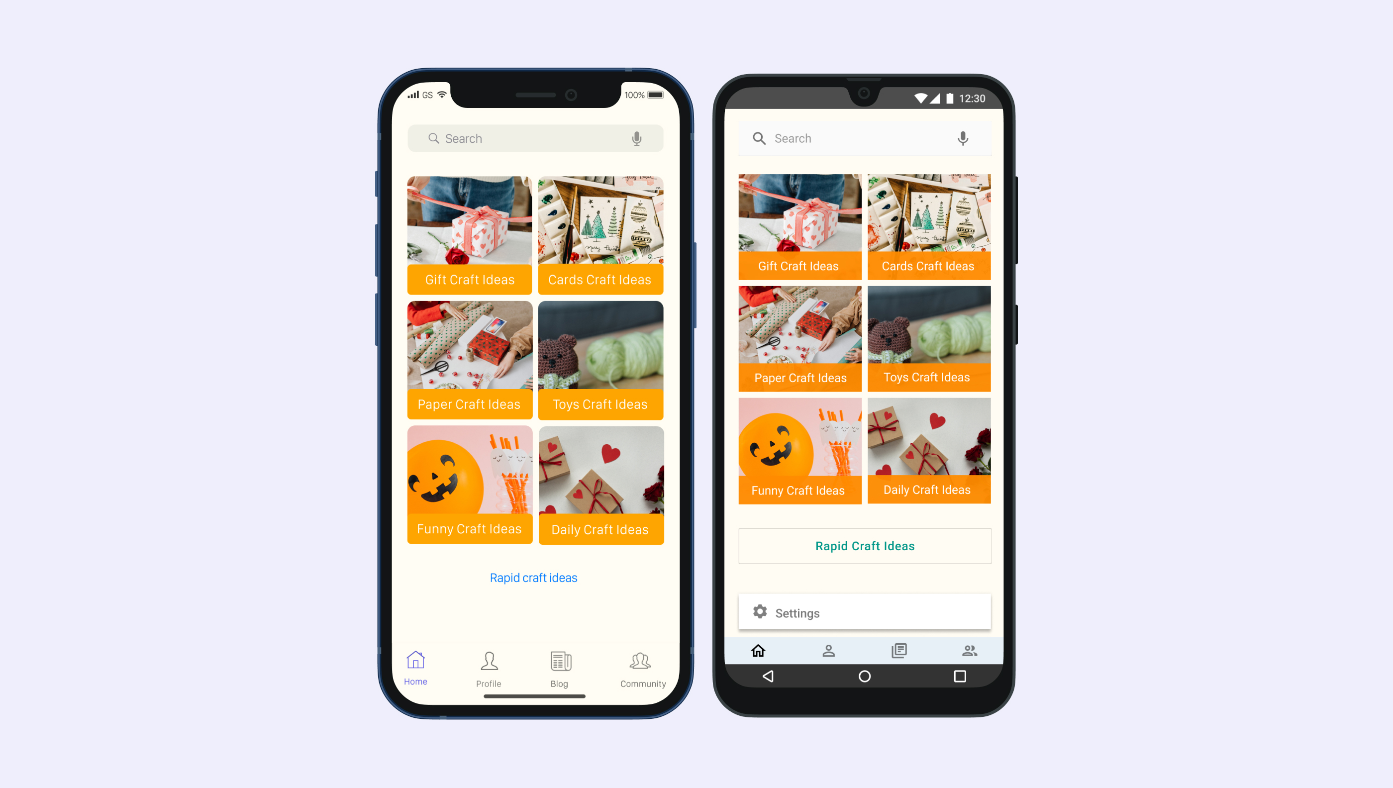
Images
The images are aimed to inspire users to use creative ideas for their daily job.

High-Fidelity Wireframes and Final UI Design
After creating a style guide, I created the first version of the high-fidelity wireframes. Then I established a prototype in InVision and tested the iOS version with iPhone users and the Android version with Android users. I gave them the task to walk through the app and comment on the design and flow. Then I introduced the feedback into the last version of the UI design.
The Rapid Craft Ideas Functionality
By choosing this functionality, the user gets a list of rapid craft ideas to use.
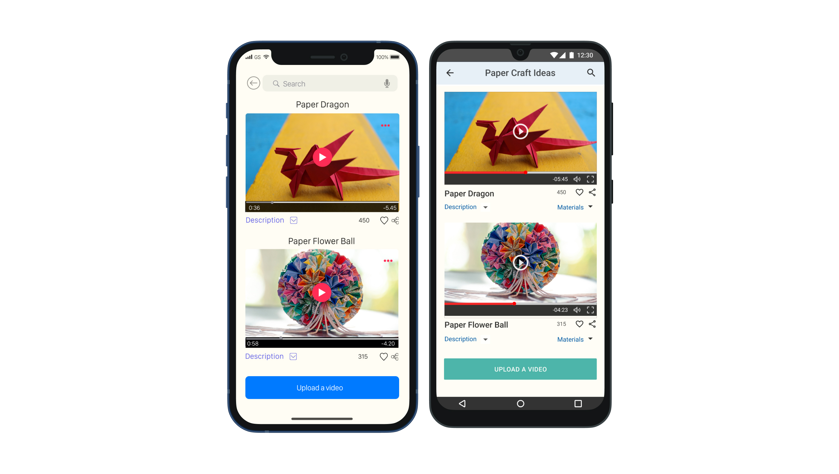
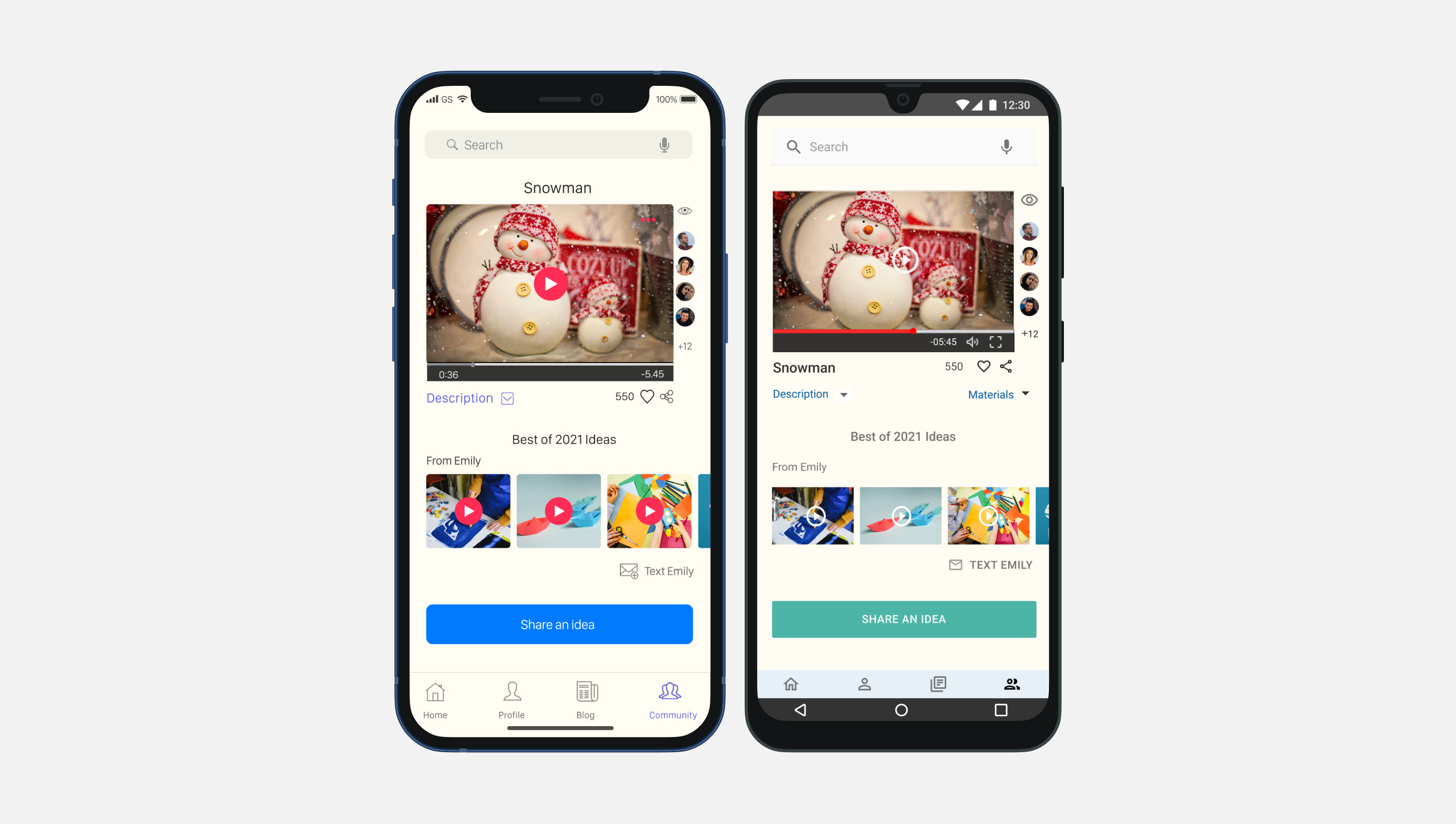
Share Your Ideas
Uploading a video and sharing the ideas gives the user the opportunity to create a community in order to support each other.
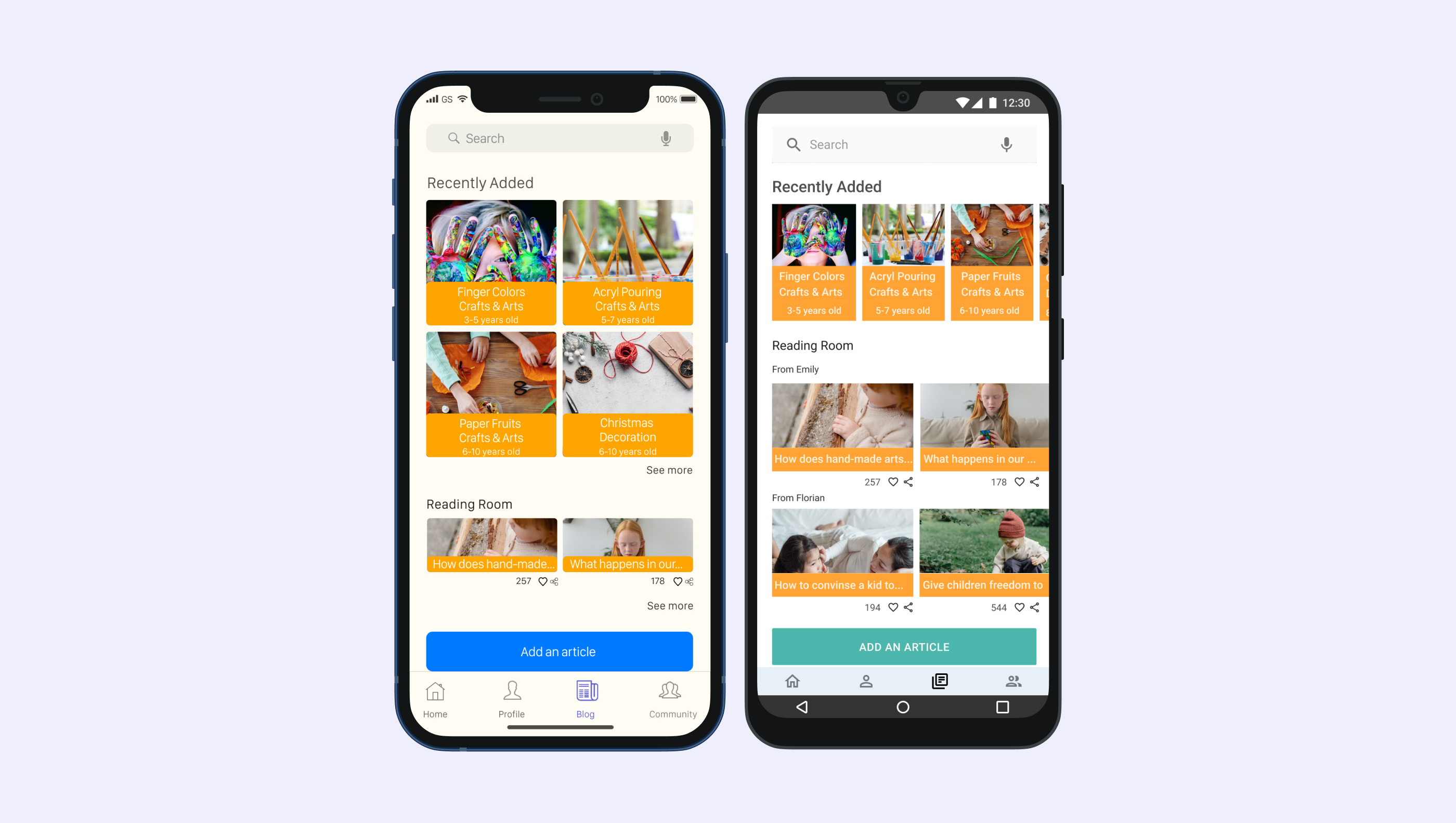
Read and/or Upload an Article
The functionality of uploading articles gives the user the possibility to share the information with his/her community.
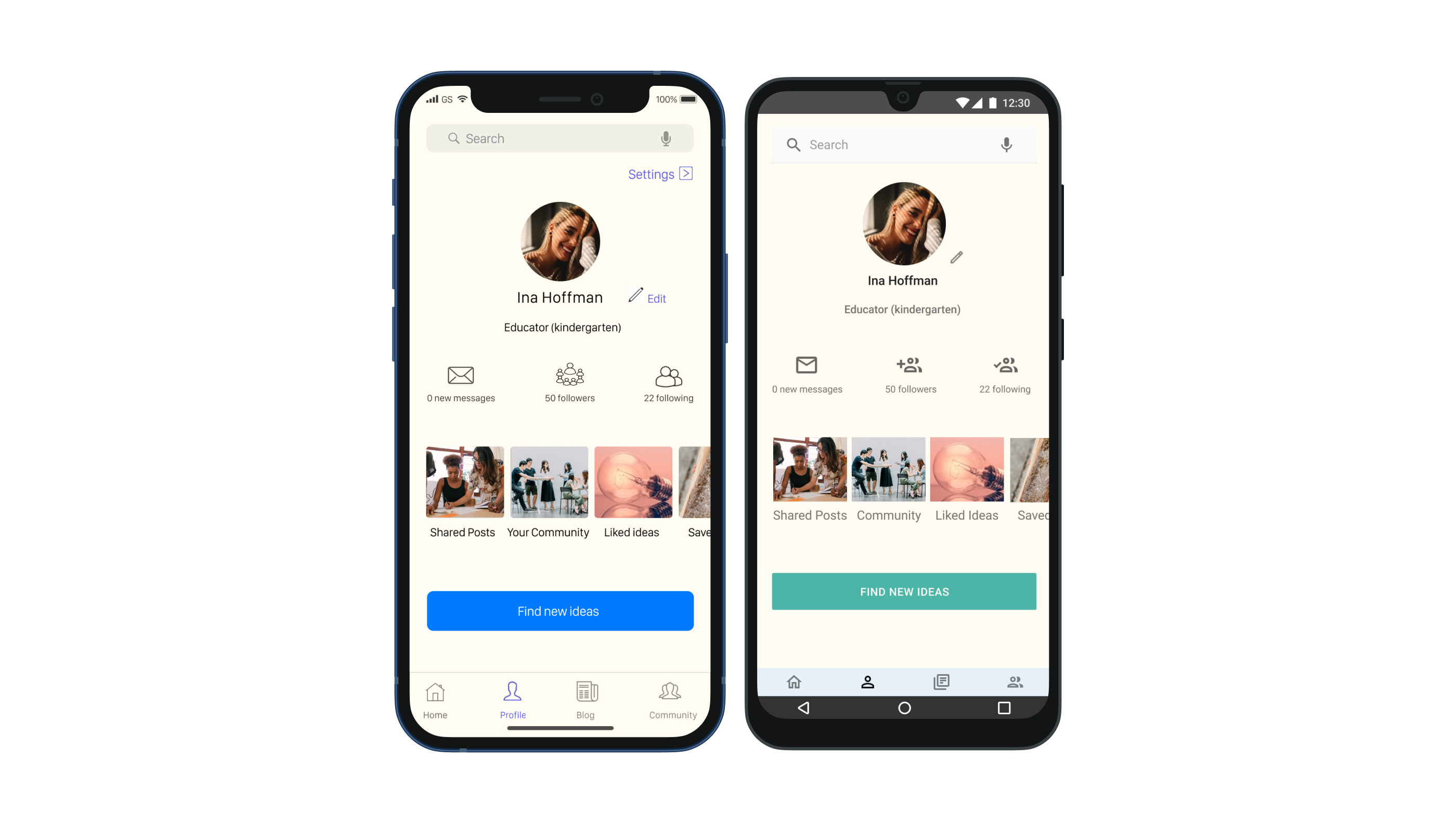
Find New Ideas
From My Profile screen the user can jump directly into looking for new ideas.
Learnings
#1
Look for specific features that would differentiate your product from other similiar ones
From the competitor analysis phase I learnt that there are lots of apps out there with the same idea as mine. My task was to analyse what can my product offer that others can't.
#2
Making notes on all details about the project is important
No matter how insignificant it might seem, at the end of the day each detail matters. At some point, you would like to go back to remind yourself why you took namely this design decision and not another one. Having everything noted eases the job.
#3
Take yourself time to choose the right UI elements for your project
Time spent on choosing the right colors, the right fonts, the right icons and images is not a lost time! It's important to have a clear color palette before you dive properly into implementing the UI elements in your design. Colors have a psychological effect on people, so it's not just about how it looks like. It's about how it feels like.
